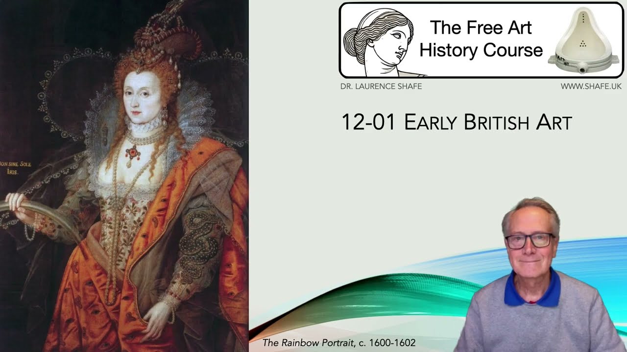
12-01 Early British Art
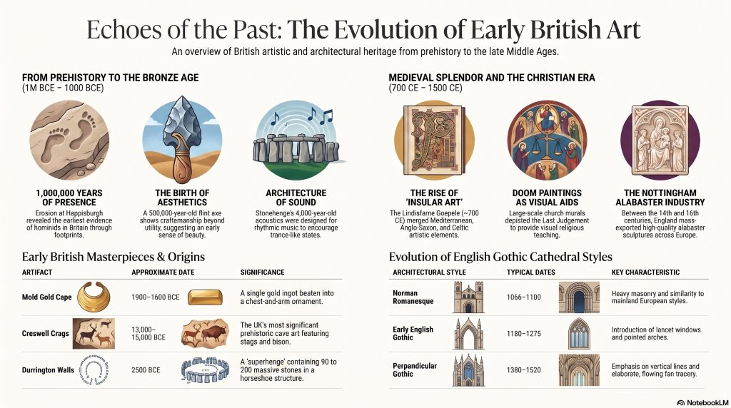
This talk is an introductory overview of early British art and history, tracing the region’s cultural development from prehistoric times through the Middle Ages. The text highlights significant archaeological findings, such as million-year-old footprints and a 500,000-year-old flint axe found at Happisburgh, which suggest early aesthetic leanings. It explores monumental structures like Stonehenge, examining its sophisticated acoustic properties and its place among thousands of other ancient stone circles. The source also showcases masterful craftsmanship through items like the Mold gold cape and the intricate illustrations of the Lindisfarne Gospels. Furthermore, it provides historical context regarding ancient migrations, the submergence of Doggerland, and the eventual arrival of the Roman Empire. Together, these excerpts illustrate how Britain’s artistic heritage evolved alongside shifts in climate, technology, and social structure.
A podcast created by Google NotebookLM from my 12-01 Early British Art notes
Early British Art – A Survey
Document Source: Excerpts from “12-01 EARLY BRITISH ART” by Dr. Laurence Shafe (shafe.co.uk)
Executive Summary:
This document summarises a lecture or presentation on the history of early British art, spanning from prehistoric times to the late 17th century (the Restoration period). It highlights key archaeological finds, the development of artistic styles, the influence of various rulers and historical events (Ice Ages, Roman invasion, the Reformation, the English Civil War, etc.), and notable works and artists associated with specific periods. The document also touches upon the social and political context in which art was created and consumed.
Key Themes and Ideas:
Concluding Point:
The presentation provides a broad overview of the development of art in Britain, from prehistoric artifacts to the sophisticated portraiture and architecture of the Stuart period. It emphasizes the interplay between artistic styles, historical events, and the personalities of the ruling monarchs.
12-02 British Art 1500-1800
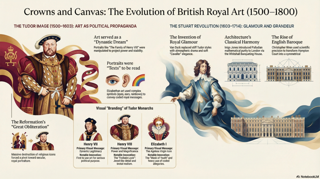
This talk presents an historical survey of British art from 1500 to 1800, beginning with the rise of the Tudor dynasty. The text highlights how early monarchs like Henry VII and Henry VIII utilized portraiture and sculpture not for aesthetic pleasure, but as potent political propaganda to assert their power and legitimacy. Significant focus is placed on the “hyper-realism” of Hans Holbein the Younger, whose works captured the psychological depth of figures like Sir Thomas More. The narrative also examines the devastating impact of religious iconoclasm during the Reformation, which resulted in the widespread destruction of English sacred art and shifted the national focus toward secular subjects. Finally, the sources analyze the complex symbolism in Elizabethan portraiture, where intricate icons were used to transform the aging Queen into an eternal, divinely guided image of stability.
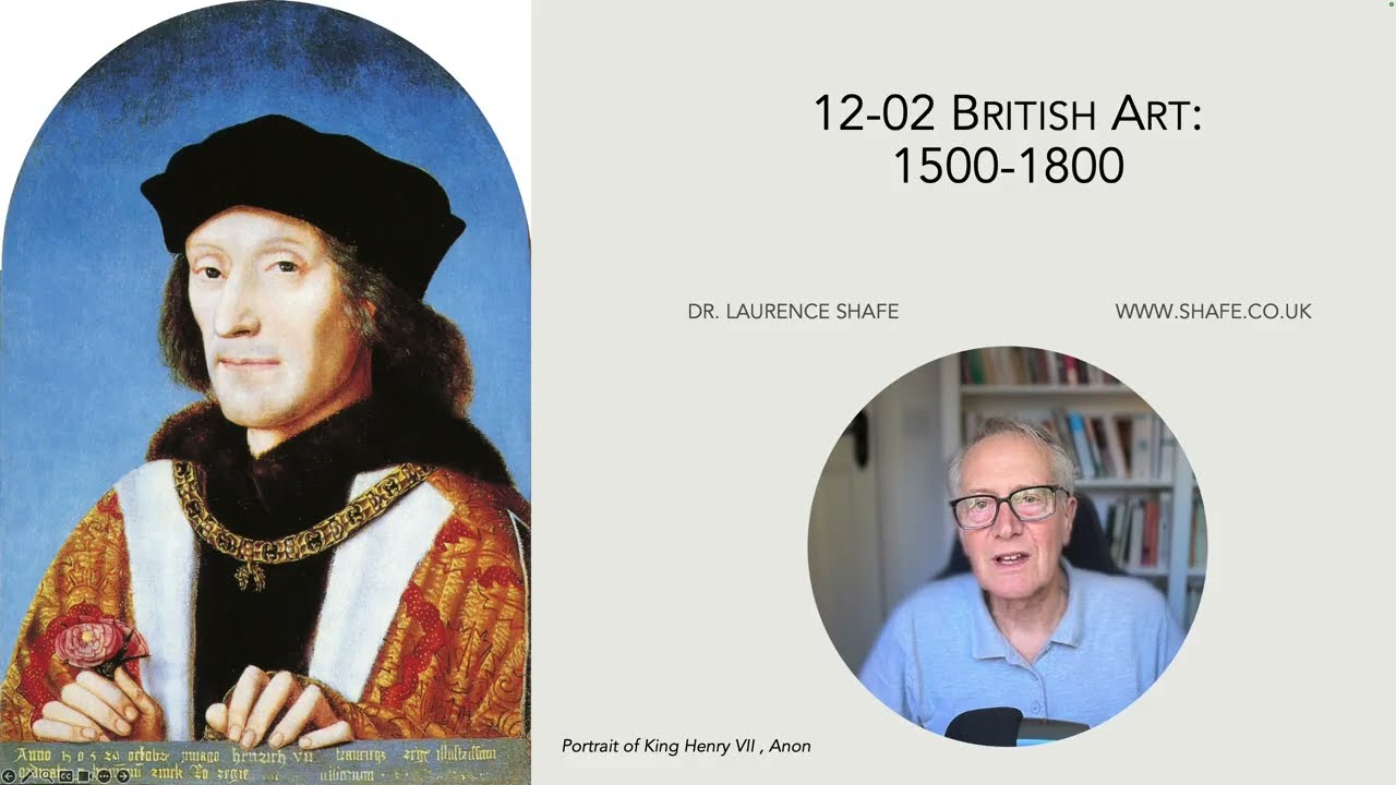
My notes on British Art 1500-1800
A discussion on British Art 1500-1800 (created by NotebookLM from my notes):
In our hyper-connected age, we treat the “curated image” as a modern invention. We speak of personal branding, the strategic use of “Instagram filters,” and the relentless pursuit of viral fame as if they were birthed in Silicon Valley. Yet, the high-stakes world of 21st-century PR is merely a digital evolution of tactics mastered 500 years ago by the British monarchy. Between 1500 and 1800, the Tudor and Stuart courts transformed art from simple decoration into a sophisticated engine for political survival and reputational management. These rulers understood that in a world without mass media, a single portrait could secure a dynasty, mask a bankrupt treasury, or turn a royal mistress into a national influencer. From “photoshopping” the aging face of a queen to the mass production of celebrity likenesses, the masterpieces of the Renaissance were the first true campaign posters. To understand modern branding, one must first look beyond the gilded frames of the past.
1. The Dead Wife Strategy: Dynastic PR at its Finest
The 1545 portrait The Family of Henry VIII is a masterclass in political fiction and brand stabilization. At the heart of the composition lies the “Golden Center”—a carefully staged throne room where Henry VIII sits enthroned in opulence, flanked by his heir, Prince Edward, and a woman who looks every bit the contented Queen. However, this woman is Jane Seymour—who had been dead for eight years when the commission began.
Including this “ghost” was a calculated move for “dynastic insurance.” By placing the long-dead Jane in the center, the artist bypassed Henry’s subsequent, more “complicated” marriages to Anne of Cleves and Catherine Howard, focusing entirely on the “successful” brand of the Tudor succession. This spatial branding is deliberate: while the King, the deceased Queen, and the male heir occupy the prestigious central axis, the princesses Mary and Elizabeth are relegated to the peripheral arches, framed by the Great Garden of Whitehall. This was not a family photo; it was a visual manifesto of stability. Even the artist’s technique functioned as a brand signature; though the painter is unknown, the work mimics the “Holbein style,” specifically the left-handed shading (moving from top-left to bottom-right) that acted as an authentication mark of royal quality.
“In the Tudor world, ‘fools’ were not mere objects of ridicule; they were often ‘natural fools’—individuals with learning disabilities viewed through a lens of religious awe as Divine Conduits. Their inclusion in this prestigious portrait—specifically Will Somers and Jane the Fool—serves as a psychological anchor, suggesting the King’s rule was protected by those who, lacking worldly logic, were closer to God and incapable of sin.”
2. Elizabeth I: The Original Master of “Photoshopping”
As Queen Elizabeth I entered her late sixties, her portraits did the impossible: they stopped the aging process. Facing a bankrupt, divided nation, her advisors realized the public required a “living icon” rather than a mortal woman. This birthed the “Mask of Youth”—a standardized face pattern that scrubbed away the scars of smallpox and the reality of time, replacing them with the ageless visage of a goddess.
The Rainbow Portrait (c. 1600-1602) is the ultimate exercise in corporate branding, where the Queen’s body becomes a “text” to be read by the discerning courtier. Elizabeth did not just wear a dress; she wore a data-set of power.
The Coded Symbols of the “Virgin Queen” Brand:
- The Eyes and Ears: Embroidered on her orange cloak, these signaled the Queen’s omniscience—a chilling reminder that she sees and hears everything in her realm.
- The Serpent: A jeweled snake on her arm represented wisdom, clutching a ruby heart to show her emotions were ruled by her intellect.
- The Colorless Rainbow: Held in her hand, it bore the inscription Non sine sole iris (“No rainbow without the sun”), casting the Queen as the solar source of national peace.
- Pearls and Crescent Moon: These specific jewels cast her as Diana/Astraea, the chaste goddess of the moon and justice, reinforcing her “Virgin Queen” market identity.
3. The “Wizard Earl” and the High-Stakes Fashion of Sadness
In the Elizabethan court, “melancholy” was not a condition to be cured; it was a high-status signifier of intellectual genius. Nicholas Hilliard’s miniature of Henry Percy, the 9th Earl of Northumberland, explores this counter-intuitive “intellectual branding.” Known as the “Wizard Earl” for his alchemical experiments, Percy used this portrait as a manifesto of his membership in the “School of Night”—a secret circle where magic and mathematics merged.
The portrait is an impresa—a proto-modern logo that uses visual puns to tell a story. Percy is depicted in a cultivated garden, striking the “melancholic pose” to signal his “genial melancholy,” a trait Aristotle linked to great philosophers. The branding here is deeply witty: a globe (representing the French espere or sphere) is balanced by a feather (the French penne) on a tree branch. This is a sophisticated pun on the family’s “Esperance” (Hope) motto and the “Peine” (Affliction) of his ancestors’ executions.
“The inscription ‘Tanti’ (‘so much’ or ‘this much I weigh’) references the Archimedean principle of the lever. It is a brilliant piece of reputational management, showing the Earl’s precarious balance between his family’s treasonous history and his own scientific weight. The book by his head and the gloves by his hand further brand him as the master of both theory and practice.”
4. Van Dyck and the Invention of Royal Glamour
Before the 1630s, English court art was dominated by the “stiff” Dutch style of Daniel Mytens. While literal, it lacked the “Signature Style” needed for a monarch claiming the Divine Right of Kings. Anthony van Dyck rebranded the Stuart court by introducing the “Van Dyck Filter”—a transition from flat, literal portraiture to atmospheric, theatrical glamour.
Van Dyck’s genius lay in “reputational enhancement.” He took Queen Henrietta Maria—who was described by contemporaries as having “skinny arms and teeth like defense works”—and transformed her into a radiant icon of grace. This shift elevated the artist’s own brand; under Charles I, Van Dyck moved from being a “drawer” to a knighted nobleman.
The Stuart Rebrand: Before and After
- Mytens (The Before): Formal, stiff, and literal; critics noted his work often resembled a “Punch & Judy show.”
- Van Dyck (The After): Atmospheric and three-dimensional; introduced the soft lace “Cavalier” style and used moody Italian lighting to imply “regal mystery.”
5. The “Sale of the Century”: Flipping the King’s Titians
The execution of Charles I in 1649 created a unique branding crisis. The Commonwealth government needed cash but was saddled with a royal art collection that many viewed as a “toxic brand”—cursed by the blood of the “martyr” king. While European monarchs hesitated to buy for fear of the curse, Colonel John Hutchinson emerged as a savvy art speculator.
Hutchinson recognized that the aesthetic value of the collection transcended its political baggage. In a stunning display of “market entry” tactics, he snapped up Titian’s Pardo Venus for a mere £600. Recognizing the demand among the French elite, he flipped the “cursed” treasure to the French ambassador, hiking the price to £4,900. While the sale eventually saw treasures like Venus with Organ Player exit Britain for the Spanish crown, Hutchinson’s speculation proved that even a “toxic” royal provenance could be rebranded for massive profit.
6. The Mezzotint Revolution: Making Mistresses Viral
With the Restoration of Charles II, the royal image shifted from “divine power” to the dawn of “influencer culture.” The face of this movement was Barbara Villiers, the King’s notorious mistress. Cast as Minerva in Sir Peter Lely’s portrait, Villiers used art to solidify her role as the “uncrowned queen.”
The true “viral” breakthrough was technological. Lely pioneered the use of the mezzotint, a process using a “rocker” tool to create thousands of ink-holding pits in a copper plate. This allowed for the mass production of soft skin tones and “heavy-lidded” eyes without harsh lines. For the first time, images of a celebrity could be distributed far beyond palace walls, making Villiers a household name.
“Tall, voluptuous, and possessing ‘heavy-lidded violet eyes’ and a ‘sensuous, sulky mouth,’ Barbara Villiers’ image was mass-produced for a public that viewed her as both the ‘curse of the nation’ and an object of obsession. She was Britain’s first true celebrity influencer, her image serving as a constant presence in the public consciousness.”
Final Summary & Conclusion
Over these 300 years, British art underwent a radical metamorphosis. It began as a “message of power” under the first Tudors, evolved into a complex “text to be read” by Elizabethan courtiers, and finally exploded into the “celebrity culture” of the Stuart Restoration. Each era contributed a new layer to the architecture of the public image, proving that the tools of modern branding—curation, visual symbolism, and mass distribution—were forged in the royal workshops of the 16th and 17th centuries.
If these monarchs had social media today, would their branding strategies actually look any different? Or are we still just trying to master the “Mask of Youth” and the “Van Dyck Filter” in a digital age?
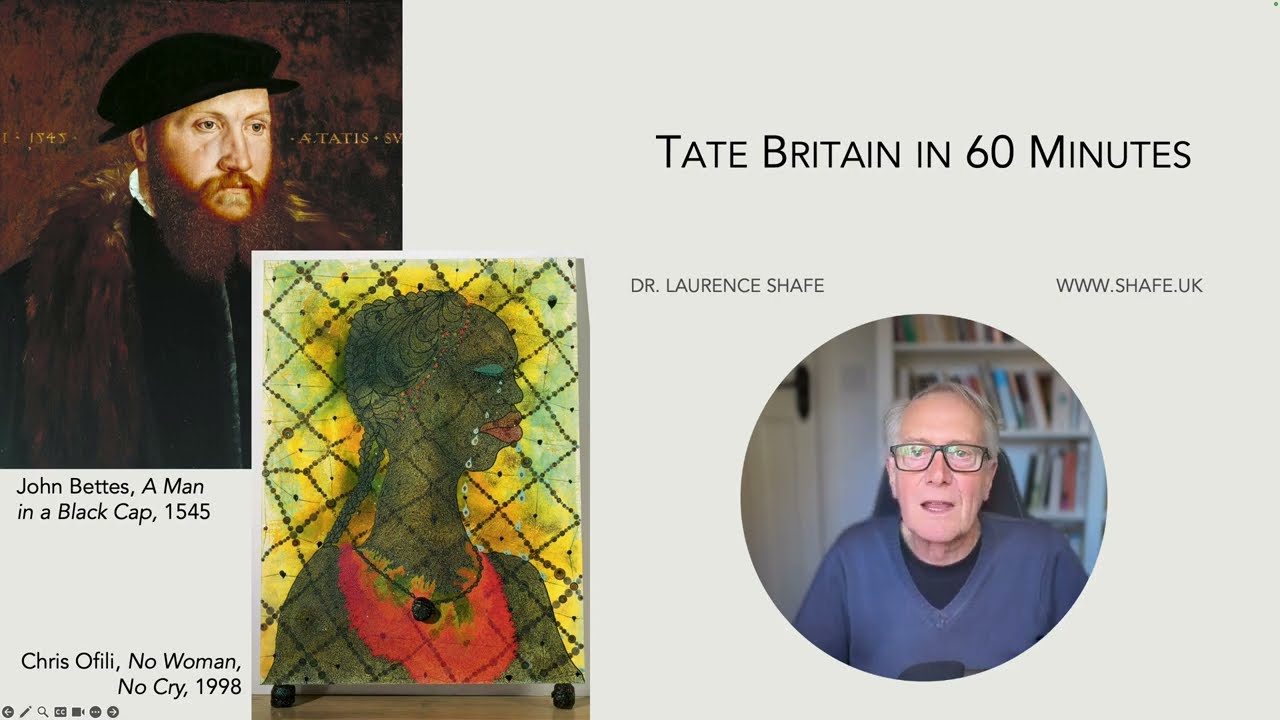
12-03 British Art in Tate Britain 1545-2000
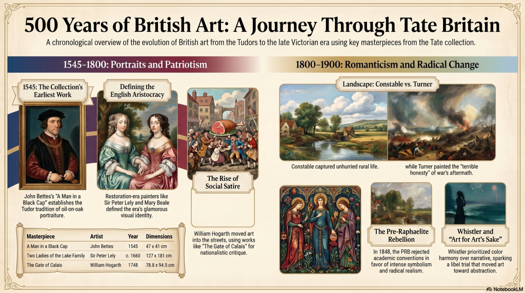
This talk is a replica of 98-03 Tate Britain in 60 Minutes
My notes on British Art in Tate Britain
A conversation about British Art in Tate Britain created by Gemini Notebook from my notes:
The Museum as a Time Machine
Step away from the gift shop and join me for a heist of history. To the casual observer, the grand, neoclassical halls of Tate Britain offer a quiet sanctuary for “stuffy” oil paintings and silent marble. But if you know where to look, these galleries are less of a cemetery and more of a crime scene. We are standing within a repository for five centuries of human drama, fueled by personal revenge plots, scientific obsessions, and social scandals that once set London ablaze.
What we now view as venerable masterpieces were, in their day, radical acts of subversion or gruesome technical experiments. Before we begin our whistle-stop tour, remember that a painting is never just a pretty picture—it is an argument frozen in pigment. Let’s pull back the curtain on six of the most fascinating “conspirators” hidden within these walls.
1. The Earliest Face in the Tate (And Its Faded Blue Sky)
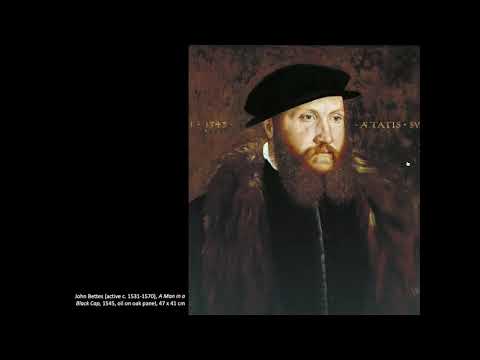
Our first stop is tucked away in 1545. John Bettes’s A Man in a Black Cap is the elder statesman of the collection, the earliest work the Tate owns. While the unidentified 26-year-old sitter appears stoic, he is a survivor of a much larger, lost work. The oak panel was once larger but has been brutally cut down at the sides and bottom, leaving us with a literal fragment of history.
Bettes was no amateur; he worked for Henry VIII and even received commissions from the King’s final wife, Catherine Parr. He likely trained in the studio of the legendary Hans Holbein the Younger, a pedigree proven by his use of “pink priming” on the wood. However, time has betrayed Bettes’s original vision. The background, a somber brown today, was originally a vibrant, royal blue. Bettes used “smalt,” a cheap cobalt-glass pigment that is notoriously unstable. Unlike the prohibitively expensive ultramarine, smalt fades when exposed to light, turning a brilliant sky into a muddy shadow.
On the reverse of the panel, Bettes left a defiant, bilingual signature:
“faict par Johan Bettes Anglois” (Done by John Bettes, Englishman)
It is a curious bit of Tudor branding—signing in the “sophisticated” French of the court while loudly asserting his English identity.
2. The Professional Mother Who Outearned the Masters
In the 17th century, the “Grand Manner” was a man’s world, yet Mary Beale (1633–1699) didn’t just participate; she dominated. Operating a bustling studio in Pall Mall, she was the primary financial provider for her family. This was a sophisticated family firm: her husband, Charles, acted as her studio manager and bookkeeper, meticulously tracking commissions and technical experiments in his notebooks.
By 1677, Beale was earning nearly £430 a year—a staggering fortune for the era. While she painted the aristocracy for profit, her most evocative works are the intimate oil sketches of her son, Bartholomew. These were not merely maternal tributes; they were “test subjects” for Mary and Charles’s investigations into new pigments and cost-cutting methods. There is a delicious irony in Bartholomew’s childhood as a constant model: he eventually abandoned the canvas entirely to become a physician, trading his mother’s pigments for a doctor’s prescriptions.
Beale was a savvy businesswoman who charged five pounds for a half-length portrait.
3. Culinary Patriotism: The Painting That Was a Literal Act of Revenge
William Hogarth’s The Gate of Calais (1748) is a masterpiece of nationalistic bile born from a personal grudge. While visiting France, Hogarth was arrested for spying after he was caught sketching the fortifications at Calais. Furious at his treatment, he used his brush to deliver a scathing rebuttal upon his return to London.
The painting is a study in “culinary patriotism.” At its center, a massive side of English beef is carried toward an English tavern, while ragged French soldiers and a bloated, corrupt friar look on with “naked longing.” Hogarth used the scene to contrast “Protestant England”—a land of plenty—with “Catholic France,” which he depicted as a realm of watery soup and superstition. Note the most biting detail in the bottom right corner: a broken Jacobite, one of the Scots who fled to France after the failed 1745 rebellion, sits pathetic and defeated with nothing but an onion and a dry crust. To the left, Hogarth even sketched himself into the scene, captured just as the hand of a French officer descends on his shoulder.
4. The Artist as Mad Scientist: Dissections in the Farmhouse
George Stubbs is often dismissed as a “sporting painter,” a label used by the 18th-century elite to deny him the status of “High Art.” In truth, Stubbs was a scientific radical. To achieve an anatomical precision that remains unsurpassed, Stubbs spent 18 gruesome months in a rented Lincolnshire farmhouse dissecting horse carcasses.
Working alongside his common-law wife, Mary Spencer—whose stomach for the macabre must have been legendary—Stubbs suspended the animals from the ceiling to strip away layers of muscle and sinew. This research resulted in The Anatomy of the Horse (1766), a project that took six years of morning and evening labor to engrave. The irony of Stubbs’s career is twofold: first, the Royal Academy snubbed him for his “low” subject matter; second, his very scientific precision is what makes his work so fragile today. He often used thin, diluted oils that have left his canvases vulnerable to the ravages of time.
5. The Prophet vs. The Physicist: Why William Blake Hated Isaac Newton
The Enlightenment celebrated Sir Isaac Newton as the man who brought light to the universe. As Alexander Pope famously wrote:
“God said ‘Let Newton be, and all was light’.”
But to the visionary poet William Blake, Newton was a teacher of “single vision”—the reduction of the organic, spiritual universe to mere cold mechanics. In his famous print Newton, Blake depicts the scientist naked and hunched at the bottom of the sea. Newton is so obsessed with his geometrical diagrams and his compasses that he is entirely blind to the coral-encrusted, colorful beauty of the rock behind him.
In a brilliant bit of art-historical “theft,” Blake lifted Newton’s muscular, constricted pose from Michelangelo’s Abias in the Sistine Chapel. By doing so, Blake transformed a Renaissance figure of power into one of limitation, arguing that the physicist’s rationalism brought only a new kind of darkness by ignoring the imaginative experience of the world.
6. “Hideous, Loathsome, and Disgusting”: The Masterpiece Charles Dickens Hated
What we today consider a Victorian treasure was once the target of a ferocious media firestorm. In 1850, John Everett Millais exhibited Christ in the House of His Parents, a work of “radical realism” that depicted the Holy Family as ordinary working people in a cluttered, dusty carpenter’s shop.
Critics were horrified by the “ugliness”—the dirty fingernails and the muscular, veined arms of Joseph. Most scandalous of all was the Christ child himself, who was depicted with red hair. In the Victorian imagination, red hair was a symbol of “degeneration” and traditionally associated with Judas Iscariot. Charles Dickens led the charge in his journal Household Words, claiming the family looked like they had walked out of Saint Giles, the most notorious, crime-ridden slum in London’s history. Dickens wrote:
“Wherever it is possible to express ugliness of feature, limb, or attitude, you have it expressed… [the Christ child is] a hideous, wry-necked, blubbering boy.”
The public’s definition of beauty eventually shifted. By 1898, the once-revolting painting was “passionately loved,” proving that today’s blasphemy is tomorrow’s icon.
The Living Gallery
These works are not static relics; they are arguments in paint that have survived centuries of shifting tastes. They remind us that the history of British art is a history of rebellion, innovation, and intense personal conviction.
As we conclude our tour, consider this: if the masterpieces we revere today were once dismissed as “revolting” or “mere illustration,” it raises a compelling question for our own era. What “hideous” smudge on a canvas today will be the “passionately loved” treasure of the year 2524?
12-04 Tudor and Stuart Art
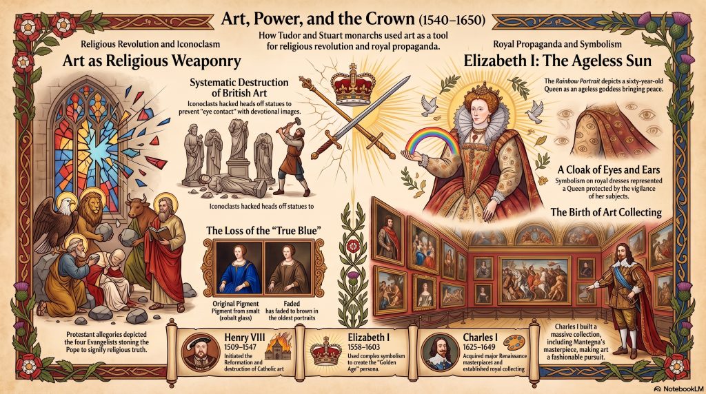
This talk discusses part of the historic art collection at Tate Britain. The primary focus is on the Tate’s founding history, specifically addressing misconceptions about Sir Henry Tate’s wealth and providing a detailed biography. It covers the beginnings of art collecting in Britain and the role of art as a religious weapon. The talk covers the Tudor and Stuart artistic periods and uses various works to explain the cultural and religious shifts in British society. It also explores the impact of the Reformation on British society and the arts, detailing how religious shifts altered the national power structure. Through various artistic references, the material serves as an educational guide to the political and cultural history represented within the Tate Britain collections.
My notes on Tudor & Stuart Art – From Absolute Monarch to Civil War, 1540-1650
A conversation about Tudor and Stuart art at Tate Britain created by Gemini Notebook from my notes:
1. Beyond the White Walls
For many, a stroll through Tate Britain is a quiet, predictable ritual—a walk past gilded frames and hushed rooms. We often view these galleries as neutral storehouses of “pretty things,” yet the history of the institution and the objects within its walls are far more scandalous than the modern visitor realizes. To the trained eye, the very ground the gallery stands on tells a story of incarceration: it was built on the site of the old Millbank Prison, a notorious penitentiary for those destined for transportation. Beneath the serene surface of the canvases lie stories of bankruptcy, violent religious purification, and sophisticated propaganda that functioned like the high-stakes mass media of its day. To truly see the Tate, one must look for the secrets hidden in plain sight.
2. Debunking the Sugar King: Henry Tate and the Slavery Question
There is a common modern assumption that the wealth used to found the Tate was derived directly from the transatlantic slave trade. While it is true that 18th-century Britain was deeply entangled in the sugar trade as a nation of consumers, the specific timeline of the gallery’s founder tells a different story.
Henry Tate was not a plantation owner; he began his career as a humble grocer’s apprentice in 1832, at the age of thirteen. It was not until 1859—more than 50 years after the slave trade was banned in 1807 and 21 years after slavery was fully abolished in the British Empire in 1838—that he entered the sugar refining business. He built his fortune on technological innovations, such as the sugar cube, and a chain of grocery stores.
The speed with which we often assume guilt by association ignores the nuances of the Victorian industrial era. As John Bush noted in a 2017 letter to The Guardian:
“It is an insult to the memory of Henry Tate, and to the reputation of the gallery that his money and paintings helped to create in 1897, to suggest that the Tate’s establishment was based on gains from the slave trade… Henry Tate was 14 years old when the act abolishing the slave trade in the British Empire became law in 1833… he made his money from a chain of grocery shops… and in the 1870s from sugar refineries… He was never the owner of sugar plantations in the Caribbean or elsewhere.”
Understanding this timeline transforms Tate from a symbol of colonial exploitation into a monument of Victorian philanthropy and the transition from trade to industry.
3. Propaganda in Plain Sight: The Queen is Watching You
If you look closer at the lining of the Queen’s mantle in the Rainbow Portrait, you’ll find a detail that suggests Elizabeth I was the 17th century’s answer to Big Brother. At the time, the royal court was obsessed with “wit, word play, and puzzles,” and this portrait was a high-tech piece of propaganda designed to project absolute power.
The portrait is a visual enigma, employing a complex web of symbols to communicate the Queen’s authority:
- The Mantle of Eyes and Ears: While her bodice is embroidered with spring flowers, the lining of her mantle is covered in literal eyes and ears. This symbolized “Fame” looking and talking about her, but it also served as a warning: her loyal subjects were always watching and listening for any intrigue or plots against her.
- The Silent Rainbow: She holds a rainbow with the motto non sine sol iris (“no rainbow without the sun”). In this allegory, Elizabeth is the sun, the only source of peace and hope for a nation weary of discord.
- The Serpent and the Sphere: Embroidered on her sleeve is the “Serpent of Wisdom” with a heart in its mouth, surmounted by an armillary sphere (a celestial globe). This signified that the Queen possessed the wisdom to control her passions and was skilled in the affairs of the universe.
This wasn’t just art; it was a sophisticated form of 17th-century surveillance culture, reminding the viewer that the monarch’s reach was both earthly and divine.
4. The Headless Saint: Art as a Casualty of War
Before it was a gallery, Britain was a site of “wholesale destruction.” During the Reformation, art became a target of religious and political “purification.” A chilling example of this iconoclasm is the statue of St. Margaret, discovered in Fingringhoe, Essex, which dates to the late Gothic period (c. 1450–1500).
The statue was found sealed in a niche, plastered over for centuries to hide it from the hammers of the reformers. Its most striking feature is its missing head. Anglican reformers and Puritan iconoclasts didn’t just break statues randomly; they “hacked off” heads or scratched out eyes specifically to prevent “eye contact” with the image, which they viewed as a form of idolatry.
This violent history reminds us of what a culture loses when art is seen as a threat. The sophisticated Late Medieval style of these devotional statues was almost entirely wiped out, leaving us with fragments that serve as ghosts of a destroyed aesthetic heritage.
5. Why Oliver Cromwell Kept the King’s Masterpieces
When King Charles I was executed in 1649, his vast art collection—one of the finest in Europe—was sold off by Parliament to pay his many creditors. The King had been a notorious spender; his agent, Daniel Nys, actually went bankrupt and died in debt after purchasing Mantegna’s The Triumphs of Caesar for the crown.
Curiously, Oliver Cromwell—the revolutionary leader who oversaw the King’s downfall—specifically refrained from selling the Triumphs. While he cleared out almost the entirety of the monarch’s “Catholic” and “monarchical” treasures, he kept Mantegna’s masterpiece almost alone among Charles’s collection.
The reason was purely an act of military ego. The paintings depict a triumphal military parade celebrating Julius Caesar. Cromwell likely saw more of himself in a victorious general than he did in a doomed king. It is a striking irony of history that a man who fought to dismantle the monarchy found common ground with a king through the lens of a military leader’s grandiosity.
6. The “Mystery” Object at the Ball
Art also preserves the “visual puzzles” of daily life that we have long forgotten. In Sir William Quiller Orchardson’s Her First Dance (1884), modern viewers often squint at a mysterious, flat black object held by one of the men.
This object is a folded “bicorn hat.” Unlike the stiff tricorns of the past, the bicorn was a piece of pseudo-military finery that was designed to fold completely flat. This allowed men at Regency balls to carry their headwear tucked neatly under their arm while dancing, preventing it from becoming a cumbersome obstacle in the ballroom. What looks like a strange shadow today was once the height of practical fashion for the well-dressed courtier.
7. Conclusion: The Living Gallery
Tate Britain is not merely a collection of silent objects. Every frame is a window into a complex social history of survival, power, and religious upheaval. From the site of a former prison to the surveillance symbols on a Queen’s mantle, the gallery tells a story of a nation constantly reinventing itself through the art it creates—and the art it destroys.
If our modern lives were captured in symbols today, much like the eyes and ears on Elizabeth’s dress, what “visual puzzles” would future historians find embroidered on us?Gemini Notebook can be inaccurate; please double-check its responses.
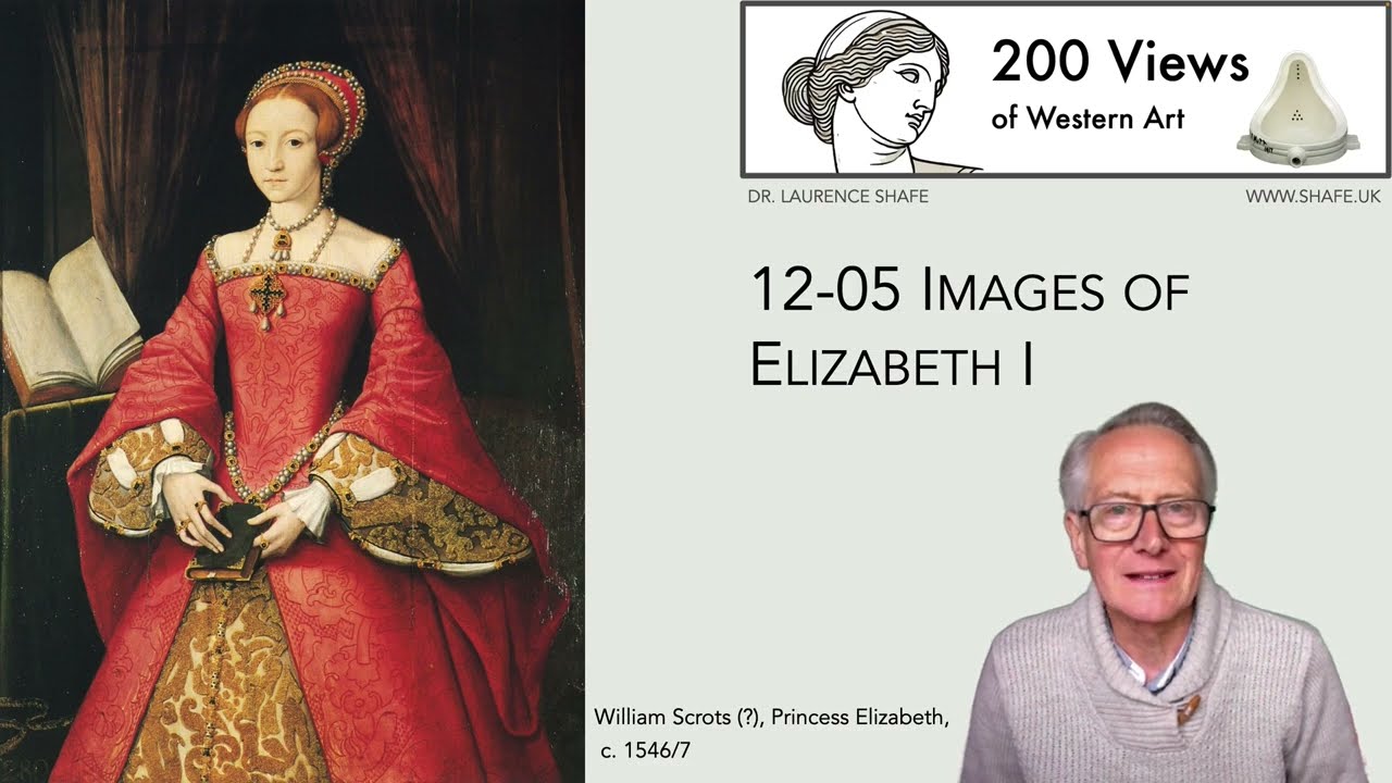
12-05 Images of Elizabeth I: Fashion or Propaganda?
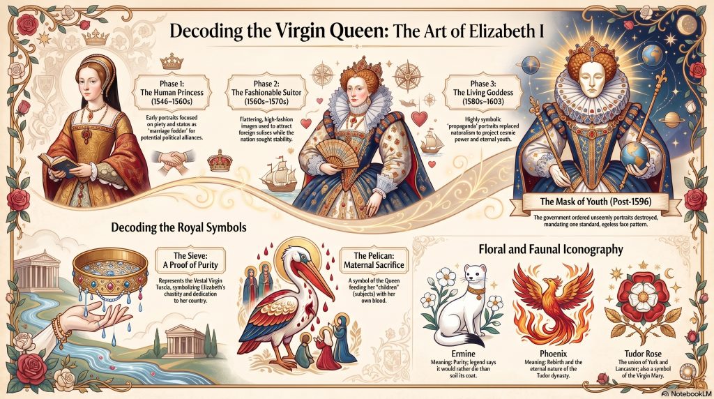
This source provides an examination of Elizabeth I’s life and legacy, specifically through the lens of Tudor portraiture and political image-making. It contrasts her early depictions as a modest princess with the later, iconic “mask of youth” and allegorical portraits that projected cosmic power and eternal virginity. The talk highlights how her administration utilized symbols, classical mythology, and religious archetypes to establish authority in a nation recovering from religious upheaval and financial instability. Key elements such as the Sieve, Armada, and Rainbow portraits are analyzed as strategic propaganda designed to communicate messages of purity, wisdom, and imperial dominance. Additionally, the material details Elizabeth’s exceptional education, her complex relationships with advisors like William Cecil, and the tactical use of her unmarried status to manage foreign suitors. Ultimately, the source illustrates how the Queen transformed her public identity into a semi-mystical icon to secure her position as a formidable female monarch.
My notes on Images of Elizabeth I: Fashion or Propaganda?
A podcast by Google NotebookLM based on the notes for 12-05 Images of Elizabeth I
The talk explores how Elizabeth I and her advisors strategically used portraiture and symbolism to construct and reinforce powerful messages about her reign, particularly focusing on her identity as a female monarch, her power, her virtue, and the idea of a new Golden Age for England.
Main Themes:
Most Important Ideas and Facts:
In conclusion, the excerpts demonstrate the sophisticated and multifaceted use of imagery in Elizabeth I’s reign. Her portraits were far more than mere likenesses; they were carefully constructed pieces of propaganda designed to address the unique challenges of her rule, project power, cultivate loyalty, and establish a lasting legacy as a strong and
12-06 Elizabethan Miniatures
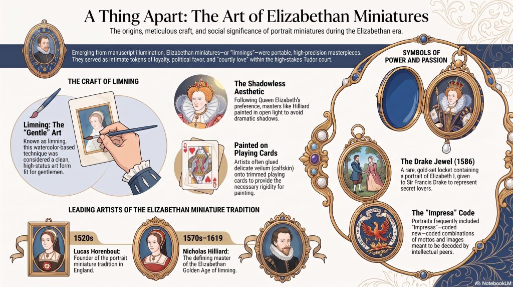
This text explores the history and technique of portrait miniatures, which evolved from medieval manuscript illumination into a highly prized art form during the Elizabethan era. Originally known as limning, these small-scale works were often painted in watercolour or gouache on vellum and backed by playing cards for stability. The sources highlight the careers of master limners such as Nicholas Hilliard and Isaac Oliver, whose portable likenesses served as intimate tokens of courtly love, loyalty, and political diplomacy. A key example discussed is the Drake Jewel, a gold locket containing a portrait of Queen Elizabeth I that was gifted to Sir Francis Drake. Beyond individual biographies, the text explains the etymology of the term miniature, derived from the red lead used in early manuscripts, and traces the medium’s transition from vellum to enamel and ivory before the rise of photography. Ultimately, these works are celebrated as a unique British artistic achievement that rivaled the prestige of Continental Renaissance masters.
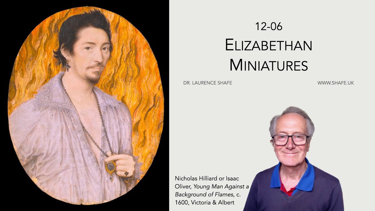
My notes on Elizabethan Miniatures
A podcast created by Google Notebook LM from my notes on 12-06 Elizabethan Miniatures
1. Introduction: A Miniature Revolution
In an era of global exploration and high-stakes courtly intrigue, the powerful elite of Elizabethan England were obsessed with an object no larger than a pocket watch. Today, we take the ability to carry images of our loved ones for granted, but in the sixteenth century, no photography existed to bridge the gap of absence. When a husband went to war, a son emigrated, or a daughter married into a distant house, the only way to keep a likeness “close to the heart” was through the portrait miniature.
These tiny masterpieces were far more than mere trinkets; they were described by contemporaries as a “thing apart from all other painting or drawing.” Known at the time as “limning,” this art form was a private, portable, and intensely personal medium that allowed Elizabethans to navigate the complex waters of loyalty, secrecy, and “courtly love.” To the modern eye, they are masterpieces of scale; to the Elizabethan, they were a revolution in intimacy.
2. It’s Not About the Size: The Surprising Origin of “Miniature”
It is a common misconception that the word “miniature” is derived from the small scale of the paintings. In reality, the etymology is rooted in the technical process of the art rather than its dimensions. The term transitioned from the Italian miniatura, meaning manuscript illumination, back to its Latin source.
While the modern association with “smallness” developed because medieval manuscript illustrations happened to be small—aided by the linguistic gravity of Latin words like minor and minimus—the true history is one of light and color. While the word “miniature” comes from the pigment, the English term “limning” derives from the Latin luminare, meaning “to give light.” This shares an origin with “illumination,” reflecting the bright colors, gold leaf, and silver used to make these portraits glow.
“The word miniature… is derived from the Latin verb miniare (‘to colour with minium,’ a red lead)… used in ancient times to make red ink.”
3. The High-Stakes Canvas: Painting on Playing Cards
The construction of these portraits reveals a fascinating irony: the most prestigious art of the age was often supported by common gambling tools. To create a miniature, an artist would use watercolours or gouache (opaque body colour) to paint on stretched vellum—a high-quality calfskin technically known as vitulinum. Because vellum is thin, it requires a rigid backing to remain stable.
For this purpose, Elizabethan artists utilized playing cards, many of which originated in Rouen, France. One famous example by Hans Holbein the Younger, a Portrait of a Lady (possibly Katherine Howard), was laid onto the four of diamonds. There is a poetic resonance in this choice: for miniatures intended as love tokens, artists would specifically choose “hearts” as the backing. This practice stood in stark contrast to the era’s social tensions; while the elite wore these images, Puritans were actively destroying playing card packs, viewing them as sinful tools of chance.
4. The Foundations of English Limning
While Nicholas Hilliard is the name most associated with this era, he did not work in a vacuum. An art historian must look back to Lucas Horenbout, a Netherlandish painter who moved to England in the 1520s and is considered the founder of the English portrait miniature. Following him was Levina Teerlinc, the daughter of the great Flemish illuminator Simon Bening. Teerlinc was a vital transitionary figure who served four Tudor monarchs. Her talent was so highly prized that her royal annuity was £40—ten pounds more than the salary paid to the legendary Hans Holbein the Younger. It was upon this foundation of Continental expertise that the distinct English style was built.
5. The “No-Shadow” Mandate: A Queen’s Scientific Misunderstanding
One of the most striking features of Elizabethan miniatures, particularly those of the Queen, is the “flat white face.” This aesthetic was not merely a trend but a specific royal mandate. During a 1572 sitting with Nicholas Hilliard, Elizabeth I expressed a strong preference regarding the use of light.
Believing that the “cunningest” Italian painters did not use shadows, she demanded that Hilliard paint her in the “open alley of a goodly garden” to ensure the light was even and direct, avoiding the dramatic “chiaroscuro” found in larger oil works.
“When first I came in her Highness’s presence to draw… she noted great difference of shadowing in the works… and that the Italians, who had the name to be the cunningest and to draw best, shadowed not.”
While this may have been a misunderstanding of Italian technique, it served a practical purpose. The heavy use of white cosmetics was a sign of status, but for Elizabeth, it was a vital mask for the scars left by her near-fatal bout of smallpox in 1562.
6. Art for Gentlemen, Not Craftsmen
In the sixteenth century, oil painting was often viewed as a messy, laborious manual craft. Limning, however, was marketed as a “Gentle Painting.” Because it used watercolours, it was “clean” and allowed the artist to remain “not the master of one’s time”—meaning the work could be set aside at a moment’s notice to attend to courtly duties.
This distinction allowed artists like Hilliard and his pupil Isaac Oliver to maintain the status of “gentlemen” rather than common laborers. In their self-portraits, they notably omit the “tools of the trade,” such as brushes or palettes, choosing instead to appear in elegant, refined attire. Hilliard’s own Treatise on the Arte of Limning (c. 1600) made this exclusivity explicit.
“None should meddle with limning, but gentlemen alone, for that it is a kind of gentle painting… it is a thing apart from all other Painting or drawing and tendeth not to common mens vsse.”
7. The Drake Jewel: A Commoner’s Imperial Prize
The “Drake Jewel” represents one of the most significant diplomatic uses of the miniature. It was a rare and unusual gift from Queen Elizabeth to a commoner, Sir Francis Drake, likely presented to commemorate his role in the 1588 defeat of the Spanish Armada. Drake had earned this “secret of the Realm” by bringing back treasure that exceeded the entire crown’s income for the year.
The jewel is a masterclass in Renaissance symbolism. Inside the locket is a portrait of the Queen by Hilliard, paired with a phoenix—a symbol of chastity and rebirth. The exterior features a sardonyx cameo depicting an African man and a European woman. Crucially, the man wears a paludamentum, the mantle of a Roman emperor or general. By choosing this imagery, Elizabeth signaled her imperial ambitions on a global scale, honoring the man who was the first Englishman to circumnavigate the globe.
8. The Tragic Paradox of Nicholas Hilliard
Despite being compared to titans like Michelangelo and Raphael, Nicholas Hilliard’s life was defined by a tragic financial paradox. He enjoyed international fame and was prized by the Medicis, yet he lived much of his life in crushing debt. The “careful” Queen did not grant him an annuity until 1599, far too late to settle his accounts.
His struggles eventually led him to a debtor’s prison at the age of 70. When he died in 1619, his son Laurence spent 52 shillings on his funeral. To put this in perspective, 52 shillings was the price of a cow or the equivalent of 52 days’ wages for a skilled tradesman. It was a final, expensive effort to ensure that Hilliard was buried with the dignity of the “would-be gentleman” he had always aspired to be.
9. Conclusion: A Lost Language of Symbols
Elizabethan miniatures were never intended to be simple pictures; they were a “deliberately created intellectual language” known as imprese. These combinations of word and image were meant to be puzzling and obscure, understood only by the “in-set.” This culture reached its peak during the Accession Day Tilts—gigantic public spectacles where knights wore elaborate costumes and carried shields to praise the Queen.
One sees this language in Hilliard’s Young Man Among Roses, where the sitter (likely Robert Devereux, 2nd Earl of Essex) leans against a tree entwined with eglantine, or dog rose—the Queen’s personal flower. His black-and-white attire signaled constancy and chastity, a visual vow of “noble suffering” for his unattainable monarch. In our age of digital, disposable images, these miniatures remind us of the power of the physical object. They were secrets held in the palm of the hand—private, permanent, and steeped in a symbolic language that required a lifetime to learn. One must wonder: in a world of infinite photos, do we still possess art that carries such weight?
12-07 The Secrets of Tudor Art
These sources provide a scholarly examination of Tudor and Stuart art, specifically focusing on the complex symbolism and secret messages embedded in Elizabethan portraiture. Central to the discussion is a cryptic miniature of Henry Percy, the “Wizard Earl,” whose reclining pose signifies the contemporary fashion of melancholia as a mark of intellectual genius. The talk explains that such works, known as impresas, utilized visual puns and mathematical references to balance personal themes of hope and affliction. Additionally, the sources highlight the influence of continental artists like Albrecht Dürer, whose engraving Melencolia I served as a foundational personification of the melancholic spirit for European scholars and poets. By exploring concepts like the four humours and the “School of Night,” the documents reveal how Elizabethan elites used art to navigate a world where science, occultism, and political loyalty were deeply intertwined. This overview illustrates that understanding Tudor art requires decoding a sophisticated language of ciphers and philosophical metaphors that have largely been lost to time.
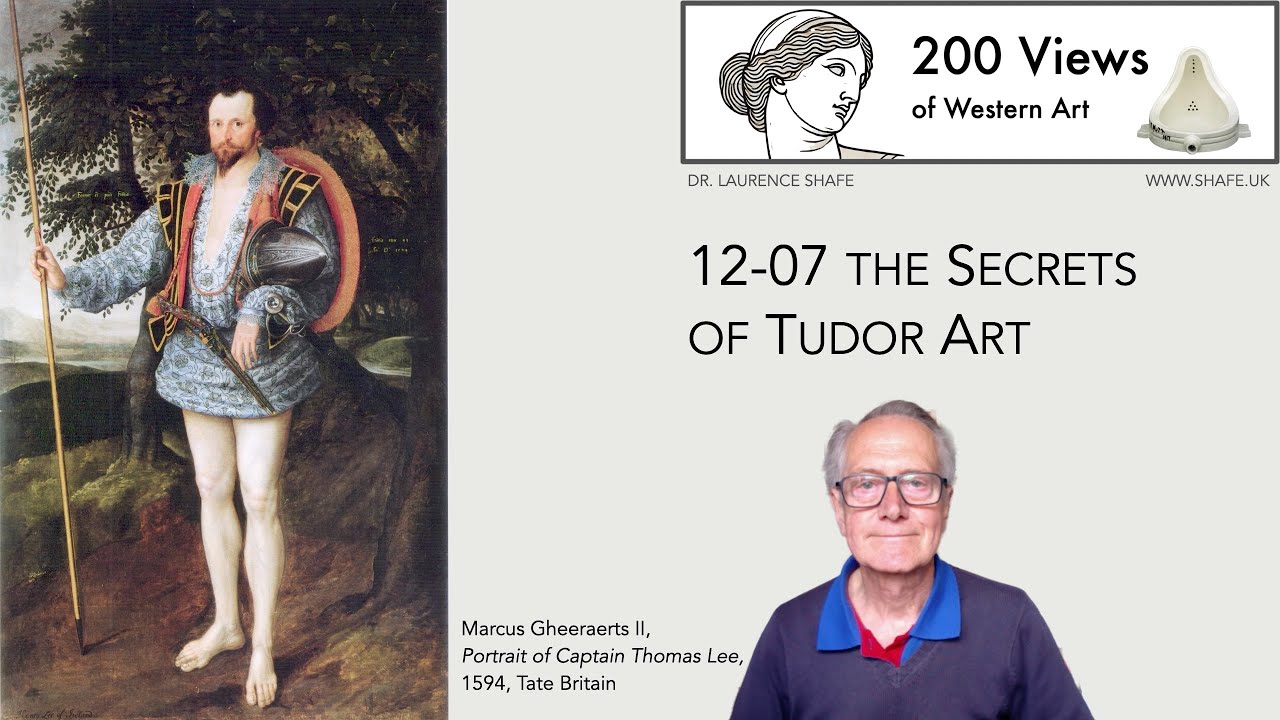
My notes on The Secrets of Tudor Art
12-07 A podcast created by Google Notebook LM based on the notes for The Secrets of Tudor Art
1. Introduction: The Art of the Hidden Message
The Tudor court was less a conventional seat of government and more a lethal, high-stakes escape room. For the Elizabethan courtier, a painting was never just a likeness; it was a sophisticated playground for puzzles and visual puns where meaning hinged on concepts like magnificence, chivalry, and the elite “flex” of melancholia. In this environment, a misunderstood symbol wasn’t merely a social gaffe—it was frequently a death warrant. To look at a Tudor masterpiece is to enter a world of ciphers designed to be decoded only by a select, intellectual inner circle.
2. Sadness as a “Flex”: The Cult of the Melancholic Genius
In the Renaissance, being “sad” was a distinct status symbol rooted in the theory of the four humours. An excess of black bile, associated with the planet Saturn, supposedly produced the melancholic temperament. This state shifted from a mark of despondency to one of “genial melancholy,” popularized by Albrecht Dürer’s widely circulated engraving Melencolia I (1514). Dürer’s brooding, winged figure personified the intellectual struggle that captivated Tudor poets like George Chapman, who embraced this “inspired melancholy” as a spiritual mark of the School of Night.
Nicholas Hilliard’s miniature of Henry Percy, the “Wizard Earl,” serves as a perfect adoption of this German-influenced fashion. Percy reclines in the Queen’s colors of black and white, his “disarrayed” appearance signaling a mind too busy with genius to bother with buttons. Aristotle’s famous query—”Why is it that all men who are outstanding in philosophy, poetry or the arts are melancholic?”—haunts the frame. Crucially, Percy is placed in a cultivated garden rather than a wild greenwood, signaling that his brilliance is tied to the rational measurement and scientific control of nature.
3. The “Impresa”: Why Your Portrait Was a Visual Pun
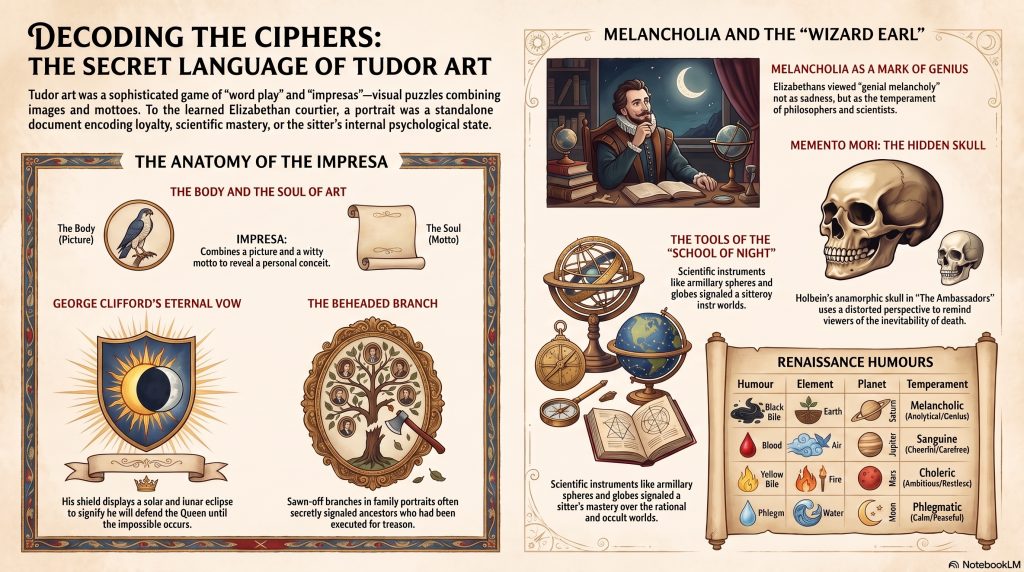
The “impresa” was the ultimate intellectual calling card of the Tudor elite. As historian William Camden famously defined it, an impresa combined a “body” (the picture) and a “soul” (the motto) to notify a “particular conceit” or private thought. These were intended to be witty intellectual riddles: neither too obscure for the learned to solve nor too plain for the common observer.
“An Impress… is a device in Picture with his Motto or Word… There is required… a correspondency of the picture, which is as the body; and the Motto, which as the soul giveth it life.”
A prime example is the “TANTI” impresa in Henry Percy’s portrait, where a heavy globe is balanced by a feather. This isn’t just a linguistic pun on “sphere” (espere/hope) and “feather” (penne/affliction); it is a sophisticated nod to Archimedes’ principles of the lever. The fulcrum point is placed closer to the sphere, reflecting Percy’s study of Archimedes’ The Little Balance. Similarly, George Clifford’s “Hasta Quan” shield displayed an impossible celestial alignment of a simultaneous solar and lunar eclipse, a visual promise to defend Queen Elizabeth until the end of time.
4. The Original “School of Night”: When Science Looked Like Magic
During the late 16th century, the boundary between what we call “science” and what was considered “magic” remained perilously thin. Intellectual titans like Henry Percy and George Clifford were members of the “School of Night,” an elite group including Christopher Marlowe and John Dee that met at Syon House. Here, they studied alchemy, numerology, and astronomy—subjects often viewed with suspicion by the uninitiated. Percy himself was so advanced he mapped the moon with a telescope months before Galileo and was among the first to observe sunspots.
In their portraits, scientific instruments served as symbols of this exclusive, “secret” knowledge. In his 1590 portrait as the Queen’s Champion, George Clifford features armillary spheres on his sleeve. These instruments represented the celestial universe and navigational mastery, signaling that the wearer was a master of both deep philosophical study and the practical mechanics of a growing English Empire. For these men, science was the highest form of courtly magnificence, a tool of power hidden in plain sight.
5. Optical Paradoxes: Hiding Death in Plain Sight
Hans Holbein the Younger was the undisputed master of encoding technical “tricks” to force his viewers into a deeper engagement with mortality. His masterpiece, The Ambassadors, is famously anchored by an “anamorphic skull” that only resolves into a human form when viewed from an oblique angle. This memento mori is surrounded by instruments that act as temporal markers; some scholars argue they encode the exact date and time of the Crucifixion: April 11, 1533. Even the “broken lute string” is a deliberate symbol of the discord and religious schism wrought by the Reformation.
Holbein applied a similar layer of optical paradoxes to his portrait of the merchant Georg Giesz. Upon close inspection, the walls are not at right angles and the table is not rectangular, creating an illusion of instability that reflects Giesz’s motto: “Nulla sine merore voluptas” (no pleasure without regret). Like the instruments in The Ambassadors, the clock and perishable flowers in Giesz’s office are not mere decorations. They are markers of the relentless passage of time and the fragility of a life built on worldly wealth and merchant seals.
6. Deadly Heraldry: When a Painting Could Get You Beheaded
In Tudor England, a symbol was a political claim that could prove fatal. The tragic case of Henry Howard, the “Poet Earl” of Surrey, remains the ultimate cautionary tale of the power of the sign. Howard sat for a portrait displaying an elaborate heraldic blazon that included the arms of Edward the Confessor. King Henry VIII, consumed by paranoia regarding the peaceful succession of his son Edward, viewed this as a direct and treasonous claim to the throne.
Howard argued that his ancestors had been granted the right to these arms, but the King’s suspicion transformed the heraldic symbol into a smoking gun. The power of the image was absolute and irreversible. Howard was beheaded for this visual transgression on January 19, 1547. In a final, bitter irony, Henry VIII himself died only nine days later. Howard’s life was sacrificed for a symbol that was technically valid, proving that in the Tudor world, the interpretation of art was a matter of life and death.
7. Conclusion: The Lost Key
We live in an age of instant, transparent information, yet we have arguably lost the ability to speak the language of the “hidden sign.” The works of Hilliard and Holbein were constructed as complex ciphers designed to protect power or project secret knowledge through a carefully maintained artifice. As historical analysis suggests, these artists and their patrons were operating on another level entirely.
“Both poet and limner in developing an artifice of secrecy were —’On Her Majesty’s Secret Service.’”
Today, we are left with only tantalizing glimpses of these hidden meanings because we have largely “lost the key” to their total interpretation. We must wonder: in our modern world of immediate clarity, what have we sacrificed by no longer valuing the depth, wit, and mystery of the encoded message? To study a Tudor portrait is to realize that true power often speaks in whispers, hidden behind a feather, a globe, or a distorted skull.
12-08 How Art Helped Establish the Tudor Dynasty
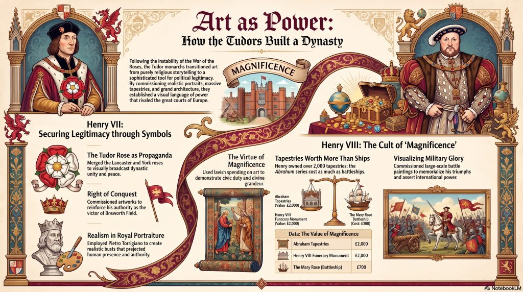
This collection of materials by Dr. Laurence Shafe explores the history of Western art, with a primary focus on how the Tudor dynasty used visual culture to solidify their authority. While the course spans from prehistoric cave paintings to the Italian High Renaissance, it specifically highlights how monarchs like Henry VII and Henry VIII employed art as a political tool. Prior to this era, English painting served mainly religious purposes, but the Tudors introduced lifelike portraiture and grand spectacles to reflect their intelligence and power. The sources emphasize the concepts of chivalry and magnificence, illustrating how expensive tapestries, gold plate, and architecture established a royal image. By comparing English developments with the work of Michelangelo and Leonardo, the talk provides a broader context for the transition into a modern, image-conscious monarchy.
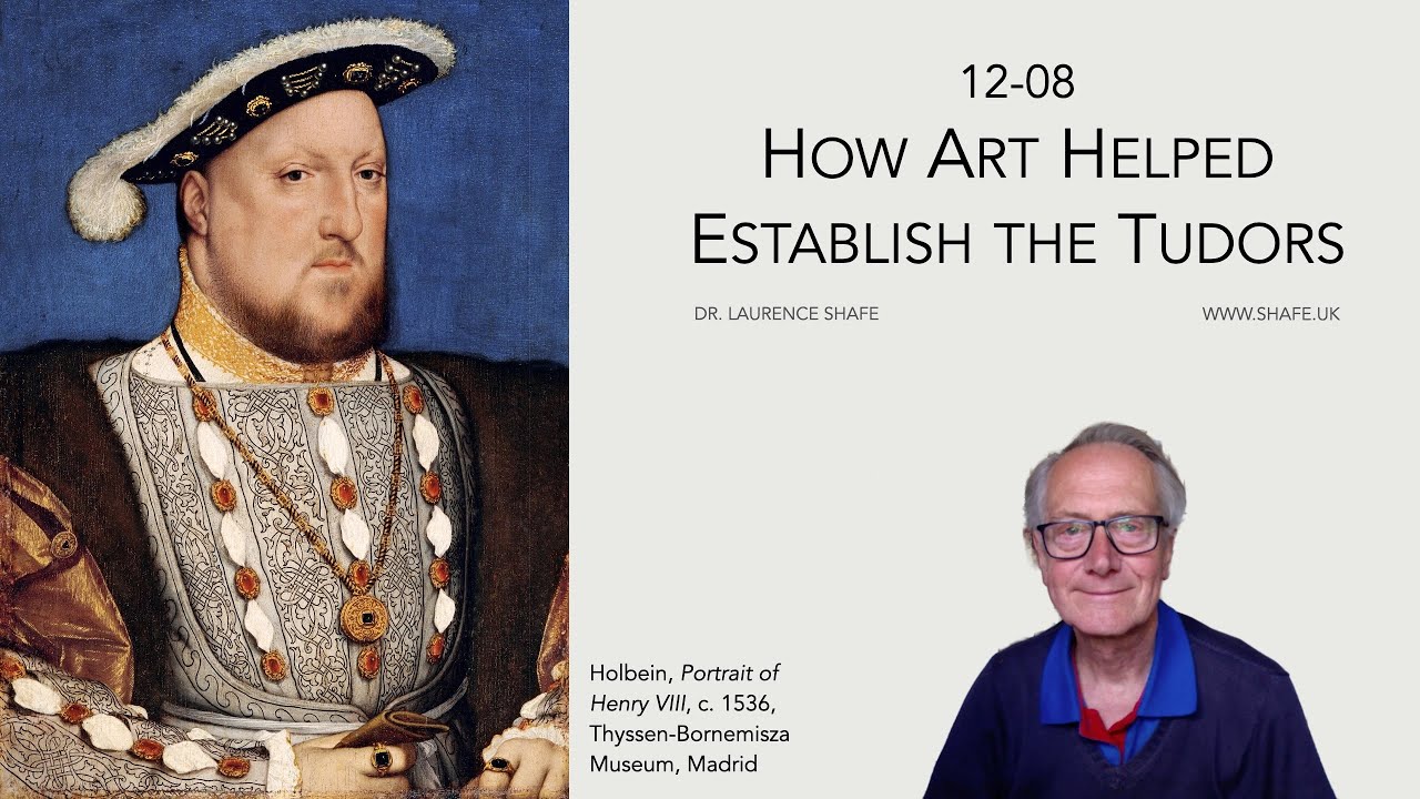
My notes on How Art Helped Establish the Tudor Dynasty
Introduction: The Imposter on the Throne
When Henry VII stood on the blood-soaked mud of Bosworth Field in 1485, he held a crown but lacked a convincing reason to wear it. He was, by any objective measure, a royal imposter—an insecure usurper with a claim so tenuous it was practically transparent. Descended from a line of Welsh gentry and a mother whose family was legally barred from the throne, Henry faced a massive, high-stakes branding problem: how do you convince a skeptical nation that a man with almost no royal blood is actually God’s chosen King?
This wasn’t just a matter of vanity; it was an urgent security issue. Henry’s legitimacy was under constant assault from “pretenders” like Lambert Simnel and Perkin Warbeck, who claimed to be the rightful Yorkist heirs. To survive, Henry had to out-brand these imposters. Before the Tudors, English royal art was a stagnant pool of symbolic, generic imagery; portraits like that of Richard II were rare exceptions, and most “royal” likenesses were painted centuries after the fact by artists who had never seen their subjects. The Tudors triggered a paradigm shift, moving away from the humble, religious “craft” of the past to unleash an explosion of “magnificence”—a calculated visual assault designed to prove they were too magnificent to be questioned.
Magnificence: Spending as a Civic Virtue
To fund this propaganda while facing an essentially bankrupt exchequer, Henry VII employed a ruthless brand of economic logic known as “Morton’s Fork.” Named after his Archbishop, the logic was a perfect trap: if a noble spent lavishly, he was clearly rich enough to be taxed; if he lived frugally, he had clearly saved enough to be taxed. This avaricious but skillful financial engine funded an intellectual loophole found in Aristotle’s Nicomachean Ethics.
The Tudors reframed “excessive expenditure” not as the sin of luxury, but as “Magnificence”—a princely virtue. While luxury was a vice of the self, magnificence was a civic duty to reflect God’s own grandeur. Following the lead of Dante, who associated magnificence with the human imitation of divine perfection, the Tudors argued that a King’s opulence was for the common good. By aligning gold-plated feasts and massive architecture with religious and civic duty, the crown transformed every staggering bill into a statement of political legitimacy.
The Ultimate Power Move: Backdating History
Henry VII’s most audacious piece of propaganda was a legal fiction. Though he won the crown on August 22, 1485, he counter-intuitively backdated the start of his reign to August 21—the day before the Battle of Bosworth. This maneuver allowed him to legally declare his enemies traitors before the first arrow was even fired, permitting him to confiscate their vast lands and wealth to bankroll his new regime.
To reinforce this “right of conquest” visually, he flooded England with the “Tudor Rose.” This was more than a pretty flower; it was a heraldic badge designed to signal the end of the civil war known as the War of the Roses. By merging the red rose of Lancaster and the white rose of York, Henry used art to suggest a divine unity. He even reached back into myth, claiming descent from the legendary British King Cadwaladr, using visual symbols to bridge the gap between his shaky reality and a glorious, invented past.
Tapestries over Battleships: The 16th-Century Status Symbol
In the 16th century, if you wanted to signal absolute power, you didn’t build a better tank; you bought furlongs of gold and silver thread. Tapestries were the ultimate status symbol, the most highly valued pictorial art form of the age. The “Art of the Flex” is best seen in the math: Henry VIII’s “Story of Abraham” tapestries cost an eye-watering £2,000. To put that in perspective, the battleship Mary Rose—the pride of the English navy—cost only £700.
A single set of hangings was worth nearly three times the price of a military flagship. Henry VIII eventually owned over 2,000 of them, turning his palaces into corridors of woven gold. As Kathryn Hallet of Historic Royal Palaces notes:
“The tapestries therefore carried a personal, dynastic and political message, as well as being a statement of cultural magnificence.”
The Sculptor Who Broke Michelangelo’s Nose
To transition from the crude “craft” of painting inn signs to the “high art” of the Renaissance, the Tudors imported elite Italian talent. The most explosive arrival was Pietro Torrigiano, a sculptor famous for a violent rivalry in which he broke Michelangelo’s nose during a fistfight.
Torrigiano brought a brutal naturalism to England that shattered the generic, symbolic royal imagery of the medieval era. Using Henry VII’s death mask, he created a terracotta bust and funeral effigy that captured the King exactly as he was: a man with a sallow face and noticeably bad teeth. This was a strategic shift in identity; the “naturalistic” King was a specific, living human who commanded a new kind of respect. This stood in sharp contrast to the earlier 1505 portrait by an unknown Netherlandish artist—the first painting in the National Portrait Gallery. That work, featuring Henry holding a Tudor rose, was essentially a high-stakes “Tinder profile,” commissioned as part of an unsuccessful marriage proposal to Margaret of Savoy.
The “Wonder of the World” in Westminster
The ultimate architectural flex of the dynasty remains the Henry VII Lady Chapel at Westminster Abbey. Constructed between 1503 and 1509, it was intended as a massive dynastic burial site to house fifteen monarchs, ensuring the Tudor name was literally carved into the heart of English history.
The Chapel is the pinnacle of Perpendicular Gothic architecture, defined by the intricate, gravity-defying fan vaulting created by architects William and Robert Vertue. It was so technically and aesthetically overwhelming that contemporary antiquarians described it as orbis miraculum—the “wonder of the world.” By placing his tomb in such a structure, Henry VII ensured that his legacy was housed in a building that screamed permanence, wealth, and divine favor long after his death from tuberculosis.
Conclusion: A Legacy Built on Perception
The Tudors were the ultimate masters of the political pivot. They began their reign as insecure usurpers with a shaky legal claim and ended it as magnificent icons whose visual branding still defines British royalty five centuries later. They understood a fundamental truth of power that remains true today: perception is reality. If you look like a King, spend like a King, and build like a King, the world will eventually forget you ever had to steal the crown.
Thought-Provoking Question: In an age of digital branding and carefully curated social media “flexing,” are we still using the Tudor playbook of ‘magnificence’ to signal our own legitimacy?
12-09a Tudor Hampton Court
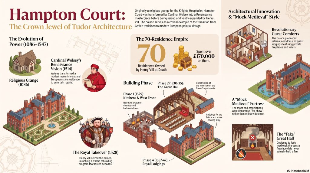
This document provides a comprehensive historical and architectural overview of Hampton Court Palace, tracing its evolution from a medieval manor to a premier royal residence. It details the building’s transformation under Cardinal Wolsey and its subsequent expansion by Henry VIII, who developed the site into a sophisticated Tudor powerhouse. The text further chronicles the palace’s usage and renovations by successive monarchs, including the massive Baroque reconstruction initiated by William and Mary under the guidance of Sir Christopher Wren. Beyond architecture, the source highlights the social and political history of the English monarchy, documenting royal births, deaths, and the eventual transition of the palace into a public monument. It also includes academic references and visual aids that illustrate the broader context of Western art history.
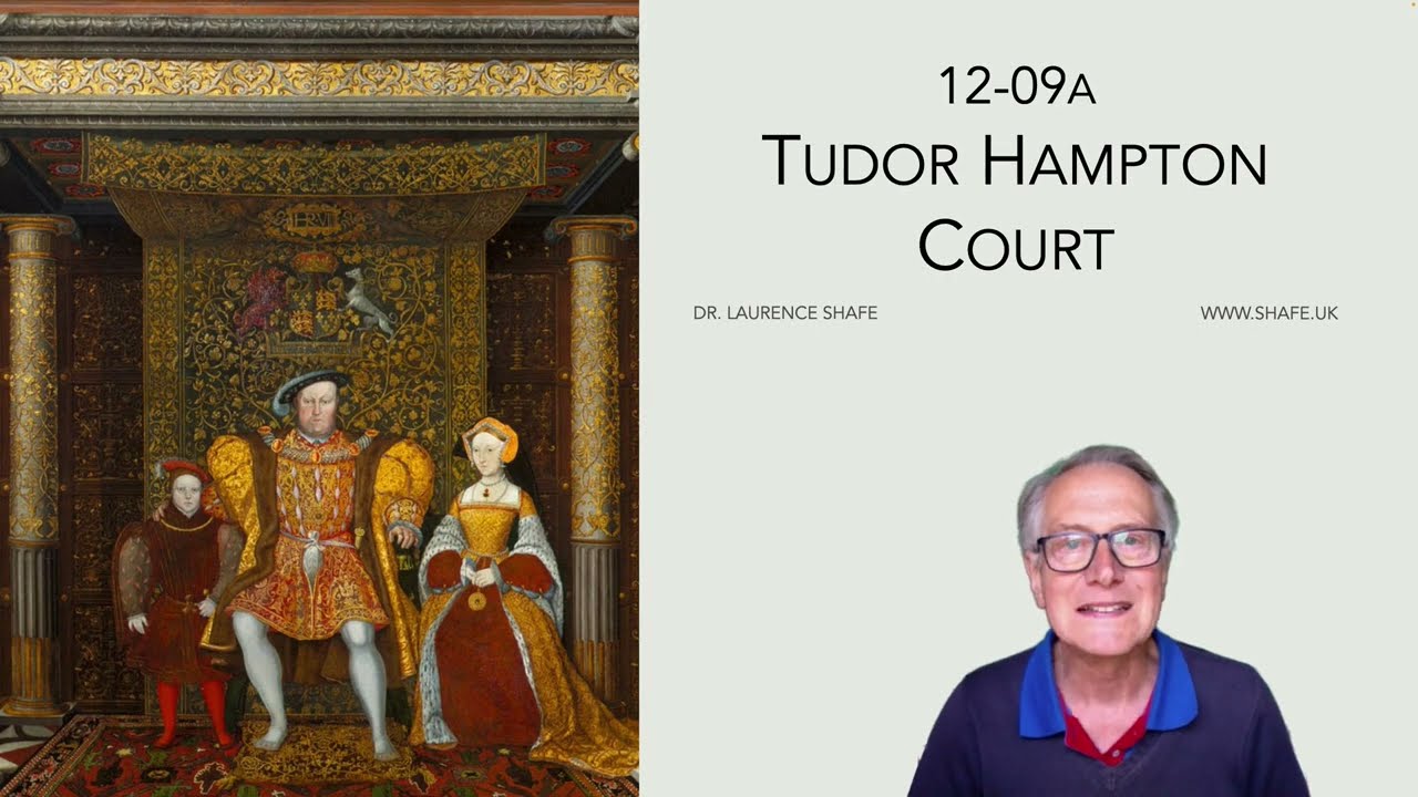
My notes on Tudor Hampton Court
Podcast created by Google NotebookLM based on 12-09a Tudor Hampton Court
1. Introduction: The Layers Beneath the Crown
To most, Hampton Court Palace is a singular monument to the gargantuan ego of Henry VIII—a red-brick fortress of absolute monarchy and marital drama. Yet, to the eye of a cultural historian, the palace is less a static building and more a living, breathing patchwork of architectural illusions, happy accidents, and historical deceptions. It is a stage set that has been constantly redesigned, burned, “Tudorised,” and reimagined across five centuries. Beyond the royal veneer lies a story not just of kings, but of a holy order, a knight’s forgotten manor, and a Victorian obsession with “faking” the past. To understand Hampton Court is to look past the crown and see the restless, human layers of ego that built it.
2. The 1478 Bell and the Holy Foundation
Cardinal Wolsey is famously credited with “founding” the palace in 1515, but he never actually owned the land. He was merely a tenant on a 99-year lease from the Knights Hospitaller of St John of Jerusalem. Before it was a royal playground, the site was a “grange”—an agricultural hub for a crusading religious order whose mission was summarized by their motto: “To Serve the Weak, to Reign the Strongest.”
Evidence of this charitable foundation remains hidden in plain sight. If you look down while walking the courtyards, you can still find the Maltese cross of the order etched into the paving stones. Even more striking is the bell hanging above the 1540 Astronomical Clock. While the clock is a Tudor masterpiece, the bell itself was cast in 1478—predating the Tudor dynasty entirely. It is a resonant reminder that the echoes of a medieval hospital still ring through the halls of a palace built for absolute power.
3. The Great Hall: A Masterpiece of Theatrical Deception
The Great Hall is the crown jewel of the palace, but it is largely a “fake.” By the 1530s, the Great Hall was an architectural dinosaur—an outdated medieval relic. Henry VIII built it as a deliberate “prop” to make his brand-new dynasty look ancient and chivalric.
The room is full of calculated illusions:
• The Soot-less Hearth: In the center of the hall, a stone dais appears designed for an open fire, yet scientific analysis of the ceiling timbers reveals absolutely no soot. A fire was never lit; the hearth was a theatrical touch to mimic the look of a medieval hall.
• The Symbolic Roof: The magnificent hammer-beam roof, though a marvel of craftsmanship, was structurally unnecessary. The hall’s 40-foot span could have been bridged with standard 12-meter timbers, which were readily available. It was built as a symbol of knightly status, not out of engineering necessity.
• The Royal Canteen: Despite its grandeur, the King rarely used the room. For most of the year, this “regal” space functioned as a high-volume canteen where up to 1,000 servants ate in two frantic shifts.
4. Tapestries: The Tudor Version of a Super-Yacht
In the 16th century, architecture was merely the shell; the real display of wealth was in the textiles. Henry VIII’s collection of over 2,000 tapestries was the Tudor equivalent of a fleet of super-yachts. A single high-end set could cost more than a literal warship.
The “Story of Abraham” series hanging in the Great Hall was the most expensive set in the Royal Collection, woven in Brussels with silver-gilt and gold thread. To maintain these treasures, Tudor servants used a surprisingly humble method: they cleaned the gold-threaded masterpieces with bread, which was used to gently brush away dust and grime. This strange juxtaposition—wealth that cost a king’s ransom being scrubbed with a loaf of wheat—highlights the intense manual labor required to keep the royal “stage” shining.
5. The Incredible Shrinking Gatehouse and Daubeny’s Ghost
The west gatehouse we see today is a shadow of its former self. In 1558, it stood five storeys high, topped by towers with prominent golden balls that glinted in the sun. It was a “Tudor mock medieval” fortress, featuring moats and crenelations that were purely for show; any real enemy could have simply climbed through the large windows. This towering facade was eventually “shrunk” by Sir Christopher Wren during 17th-century renovations and further reduced during Victorian restorations.
But the real secret lies beneath. Before Wolsey or Henry, Lord Daubeny—Henry VII’s Lord Chamberlain—built a manor house here. While much of it was swallowed by the palace, Daubeny’s original 15th-century walls and foundations still exist within the current kitchens. These stones predate Wolsey’s work by decades, serving as the hidden skeleton of the Tudor “patchwork.”
6. Poisoning the Nest: The Great House of Easement
The palace was a thrumming, unsanitary hive of 1,500 people—a population that effectively “poisoned its own nest” every few weeks. This necessitated a frantic, mobile exodus; the court progressed from palace to palace up to 30 times a year just to allow the buildings to be cleaned and to avoid the plague.
Managing the waste of such a crowd was a staggering logistical challenge. To cope, the palace featured the “Great House of Easement,” a communal toilet facility that could seat 28 people at once. The scale of the operation was immense, supported by 36,000 square feet of kitchens. In a charming twist of history, what was once Elizabeth I’s private “Privy Kitchen” has been repurposed for modern guests as the palace’s coffee shop.
7. Victorian “Tudorisation”: Fact vs. Fiction
What visitors today accept as “authentic” Tudor architecture is often a 19th-century Victorian reimagining. Queen Victoria threw the palace open to the public in 1838, and a massive “Tudorisation” effort followed to make the palace look more like the Victorians thought the 16th century should look.
This restoration happened in two distinct phases:
• 1838–1851: Workers spent £7,000 removing 17th-century sash windows and replacing them with “Tudor-style” versions. They also reduced the gatehouse by two storeys and dug out a “moat” trench where the original had been filled in centuries before.
• 1875–1900: The iconic, ornate “twisted” chimneys were added. While they are now the most famous silhouette of the palace, they are largely late-Victorian additions, built to be far more decorative than the originals.
8. Shakespeare’s “Away” Games
There is a profound irony in the fact that while the King rarely used the Great Hall for his daily life, it became the premiere stage for English literature. In the winter of 1604-1605, Shakespeare’s company, The King’s Men, turned the “servant canteen” into a gilded theater.
In a matter of hours, the room would be transformed by hanging the “Abraham” tapestries and erecting a stage for confirmed performances of:
• Measure for Measure (December 26, 1604)
• The Comedy of Errors (December 28, 1604)
• Love’s Labour’s Lost (January 1, 1605)
Staging these masterpieces in a room that was itself an architectural “fake” only adds to the palace’s legacy as a place where the line between reality and performance was always thin.
9. Conclusion: A Palace of Living History
Hampton Court is not a static monument; it is a “living document” that has been burned, collapsed, and meticulously reconstructed. From the collapse of the south range in 1689—due to the lethal speed of William III’s renovations—to the devastating fire of 1986, the palace has always been in a state of flux.
Does the “dishonesty” of the palace—the soot-less hearth, the Victorian chimneys, the nineteenth-century “Tudor” initials—make its history less real? On the contrary, it makes it more human. These layers represent the shifting values and desperate ambitions of every generation that tried to claim a piece of this site. This patchwork of truth and illusion is exactly why Hampton Court survives today; it is not just a building, but a five-hundred-year-old performance that refuses to take its final bow.
12-09b Wren’s Hampton Court
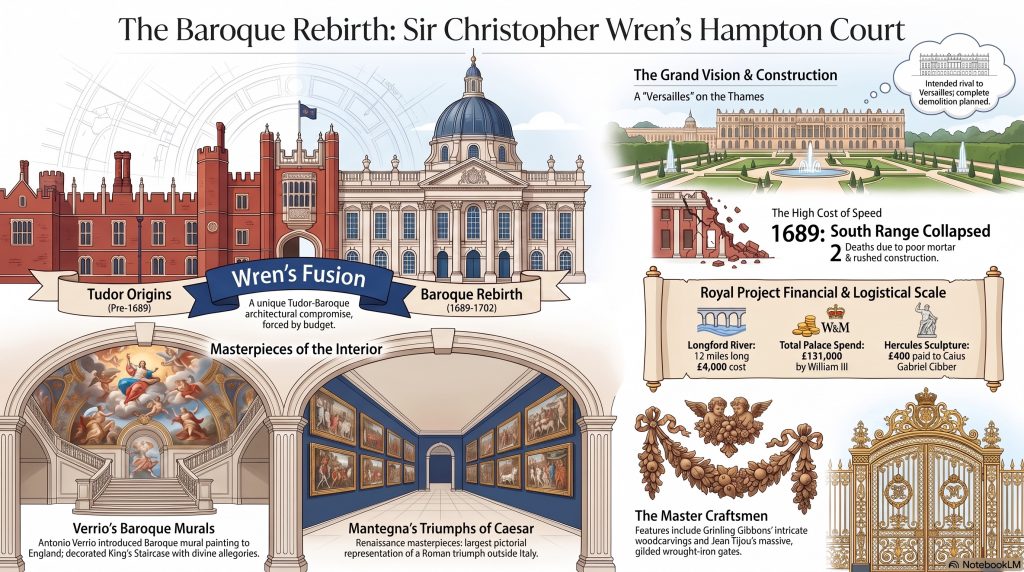
This material, curated by Dr. Laurence Shafe, provides a historical and architectural overview of Hampton Court Palace, focusing specifically on the Baroque transformation led by Sir Christopher Wren. While the palace maintains its Tudor roots from the era of Henry VIII, the sources describe how William and Mary commissioned a massive rebuilding project inspired by the scale of Versailles. Despite ambitious plans to incorporate Bushy Park into a grand entrance, financial constraints and a fatal structural collapse resulted in a more modest fusion of Tudor and Baroque styles. The text also highlights the contributions of artists like Antonio Verrio and Grinling Gibbons, while detailing the site’s royal history up until the accidental death of William III. This comprehensive guide serves as a backdrop for a broader series of lectures covering the evolution of Western Art from prehistoric times to the modern day.
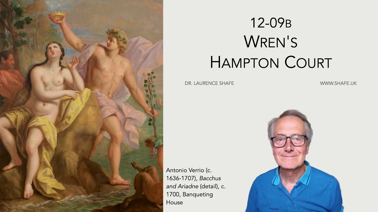
My notes on Wren’s Hampton Court
A podcast on Wren’s Hampton Court generated by Google NotebookLM
Hampton Court Palace is a startling architectural paradox. To the casual observer, it is a jarring fusion of a warm, irregular red-brick Tudor fortress and a sharp, imposing white-stone Baroque palace. This visual collision is the result of an ambitious but unrealized vision that nearly erased the Tudor past entirely.
When William III and Mary II took the throne, they viewed the existing palace as a run-down, 150-year-old relic. They commissioned Sir Christopher Wren to replace the “old-fashioned” structure with a grand monument to their power. What remains today is a fascinating dialogue between royal ambition and the budget cuts that accidentally saved British history.
1. The “Grand Scheme” Was a Total Erasure
It is a startling fact for modern visitors that William and Mary initially intended to demolish almost the entire Tudor palace. Their counter-intuitive plan was to level everything except the Great Hall to make way for a structure rivaling Versailles. Sir Christopher Wren drafted this “Grand Scheme” in 1689, a design so vast it would have realigned the entire landscape.
Wren’s vision involved shifting the main entrance of the palace to Bushy Park to create a truly royal approach. The current aerial view still reveals the skeletal outlines of this massive ambition:
• The Diana Pond: This large circle in Bushy Park was intended to be the centerpiece of the grand entrance.
• The Hunting Estate: Plans included a massive hunting park with an avenue stretching toward Kingston Hill.
• The Overlook Lodge: A lodge was planned for the end of the avenue to overlook the entire royal estate.
• The Longford River: This 12-mile-long waterway, built by Charles I for £4,000, was to feed the palace’s ambitious water features.
Ultimately, the project proved too expensive and was significantly compromised. This failure was a blessing for modern historians; had the plan succeeded, the iconic Tudor kitchens and courtyards we love today would have been entirely erased.
2. “Build Fast, Fail Fast”: The Fatal Mortar of 1689
King William III was a man in a hurry, demanding rapid results that often compromised structural integrity. This royal impatience led to a catastrophe during the construction of the new Baroque wing. The results were immediate and tragic:
• December 1689: A large section of the newly built south range suddenly collapsed.
• Human Cost: Two workmen were killed and eleven others were seriously injured.
• Cause of Failure: An inquiry revealed the cause was excessive building speed combined with poor-quality mortar.
The disaster led to “bitter squabbles” during the inquiry, highlighting the tension between Wren’s designs and William’s haste. Despite the rubble, the eventual result was the striking Fountain Court, which replaced the Tudor Cloister Green Court. The court’s repetitive, rhythmic windows create a peculiar visual effect:
“Startling, as of simultaneous exposure to a great many eyes with raised eyebrows.”
3. The “Little Gentleman in the Black Velvet Waistcoat”
The grand era of Baroque construction at Hampton Court ended with a wry twist of fate involving a common garden pest. In 1702, while riding at the palace, King William III’s horse tripped on a mole hole. The King was thrown, breaking his collarbone and later dying from a fatal infection.
The mole became an unlikely cultural icon in the aftermath of the King’s death:
• The Jacobite Toast: Irish Catholics and Jacobites mockingly toasted the mole as “The little gentleman in the black velvet waistcoat.”
• Total Expenditure: By his death, William had spent £131,000 on the palace.
• Empty Shells: Because Queen Mary had died in 1694, much of the new Baroque wing was left as an “empty brick shell” with bare walls and floors.
The King’s sudden death effectively froze the palace in its current “fused” state. Without that fatal mole hole, the Tudor sections might have eventually fallen to the next phase of demolition.
4. A Renaissance Masterpiece in a “Noble Ruin”
Inside the palace sits Andrea Mantegna’s Triumphs of Caesar, the world’s largest metric area of Renaissance paintings outside Italy. Acquired by Charles I in 1629, these canvases depict a grand Roman military parade celebrating Julius Caesar’s victory in the Gallic Wars. The paintings survived centuries of restoration, including a 1960s project overseen by Anthony Blunt.
Blunt noted a poignant connection between the art and its environment:
“The Triumphs may be a ruin but it is a noble one, one as noble as those of ancient Rome which Mantegna so deeply admired.”
There is a profound irony in housing a celebration of absolute Roman victory within this specific wing. The paintings represent the summit of a commander’s career, yet they reside in a palace wing that was a series of architectural retreats and “compromised victories” for Wren.
5. The World’s Oldest Active Sports Venue
While the grand Baroque apartments were often left as hollow shells, the functional Tudor spaces proved remarkably resilient. Tucked in the northeast complex is the Real Tennis court, which serves as a testament to Tudor longevity. It stands in sharp contrast to the “fragile” Baroque sections that crumbled during their own construction.
The survival of this area provides a unique architectural dialogue:
• 1528: The date of construction for the Tudor court, attributed in records to Henry VII.
• Longevity: It remains the oldest tennis court in the world still used for its original purpose.
• 1568: The date inscribed on a Tudor bay window added during Elizabeth I’s reign.
This Elizabethan window creates a striking visual moment where it “tightly abuts” the white Baroque stone added by Wren 150 years later. It perfectly encapsulates the palace’s history: a series of disjointed additions that somehow formed a cohesive, if accidental, masterpiece.
Conclusion: The Beauty of the Compromise
Wren’s “Versailles” failed, and that failure is exactly why Hampton Court remains a treasure. Budget cuts, sudden deaths, and poor mortar prevented the total erasure of the Tudor world. The result is a unique architectural conversation between the warm, red-brick ghosts of Henry VIII and the sharp, white-stone ambitions of William III.
If the King had never fallen from his horse, or if his mortar had been stronger, would we have lost the Tudor kitchens and Great Hall forever? We are left with a provocative thought: is the Hampton Court we love a finished palace, or just a very beautiful series of unfulfilled plans?
12-10 Hans Holbein at the Court of Henry VIII

This source provides an educational overview of the life and career of Hans Holbein the Younger, a prominent Northern Renaissance artist and printmaker. Originally from Germany, Holbein established himself in Basel before seeking his fortune in London, where he became the premier painter for King Henry VIII. The text details his professional journey, including his early religious works like the visceral Dead Christ in the Tomb and his influential woodcut series, The Dance of Death. A significant portion of the material focuses on his role within the Tudor court, highlighting his portraits of influential figures such as Erasmus, Sir Thomas More, and the royal family. Additionally, the document provides historical context regarding the Tudor monarchs and the various artistic mediums, such as jewelry and metalwork, that Holbein mastered during his career. Through a series of lecture notes and images, the author explores how Holbein’s realistic style and humanist connections shaped the visual legacy of sixteenth-century England.
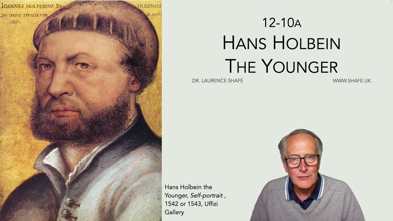
My notes on Hans Holbein at the Court of Henry VIII
An entertaining conversation about Hans Holbein the Younger created by Google NotebookLM from my notes:
To look at a portrait by Hans Holbein the Younger is to step directly into the volatile inner sanctum of Henry VIII’s court. His paintings possess a startling, almost photographic permanence that stands in haunting contrast to the fragile lives of his sitters. In the high-stakes theater of the Tudor court, Holbein was the ultimate chameleon, a man who painted the very icons of the age even as they signed each other’s death warrants.
Holbein arrived in London from Basel in late 1526, a 29-year-old artist with little more than a letter of introduction from the philosopher Erasmus to Sir Thomas More. He entered a world where a misplaced word could lead to the Tower, yet he managed to navigate these dangerous waters to become the definitive visual biographer of the Renaissance. While we recognize the famous faces he captured, the man behind the easel was far more than a mere observer; he was a strategic survivor and a master of multifaceted design.
1. More Than a Painter: The King’s Master Designer
While history remembers Holbein for his oils on oak panels, the Tudor court valued him as a high-stakes retainer for royal glamour. Upon his second visit to England, he was retained by King Henry VIII at a salary of £30 a year—a significant sum that reflected his role as the King’s master designer.
Holbein didn’t just paint the King’s world; he engineered it. His early training as a goldsmith informed his entire aesthetic, gifting him what historians call a “precision and economy of line.” This was not merely an artistic preference but a technical discipline. He approached a face with the same unforgiving accuracy required for chasing gold. We see this in his “pricking for transfer” technique: he would pierce the outlines of his preparatory drawings with tiny pinholes to transfer the exact proportions to the final panel. For Holbein, a portrait was a piece of visual engineering—a blueprint for power. This same precision was applied to the physical trappings of the court; he was paid to design everything from ornate fountains and decorative cups to jewellery and even the daggers hanging from the hips of the nobility.
2. The Macabre Realism of the “Dead Christ”
Before he became the court painter to the English elite, Holbein produced what remains one of the most jarring religious works in Western art: The Body of the Dead Christ in the Tomb (1520-22). At a time when his father, Hans Holbein the Elder, had taken him to see the traditional, guilt-evoking agony of Matthias Grünewald’s Isenheim Altarpiece, the younger Holbein chose a different, more terrifying path: clinical realism.
This was no idealized sacrifice. It was a clinical autopsy of the divine. The painting shows the early stages of putrefaction in the wounds, a radical departure during the rising tide of Lutheranism. Most unsettling are the open eyes and mouth, a detail that stripped away the comfort of a peaceful sleep.
Holbein’s painting is notable for its dimensions and the wounds which show realistic dead flesh in the early stages of putrefaction and his eyes and mouth are shown open perhaps to indicate that even in death he is all seeing and his spoken word remains.
This work was a massive risk in an age of violent iconoclasm. As the Reformation tore through Basel, religious art was being smashed in the streets. Holbein’s response was to paint a Christ so humanly dead that it challenged the viewer to find faith in the absence of beauty.
3. Inventing the “First Conversation Piece”
Holbein was a revolutionary who essentially invented the “conversation piece”—a portrait style that moved away from stiff, formal icons toward an informal family group at home. His masterpiece in this genre was the large-scale portrait of Sir Thomas More’s family.
The piece was a buzz of domestic life, featuring a pet monkey on the right, family dogs, and a clutter of prayer books and musical instruments. However, Holbein loved a hidden “Easter egg” or a strange anomaly. In the More portrait, the door to the ornate clock—a cutting-edge domestic status symbol for the 1520s—is left standing open. Nearby, the jester Henry Patenson holds a sword that appears to be missing its blade. These strange features suggest a household where the “buzz of talk” has only just subsided.
Almost without exception they have interpreted its naturalism and informality as a fairly direct mirror of everyday life in the More household. John Rowlands, for example, speaks of the artist ‘recording the family when the buzz of talk has just subsided,’ which implies that Holbein simply set down an actual moment of domestic life as it passed before him.
Though the original masterpiece was destroyed by fire at Kremsier Castle in 1752, its spirit lives on through the copies of Rowland Lockey and Holbein’s own pricked preparatory sketches.
4. The Original “Photoshop”: Constructed Impact vs. Reality
We often assume Holbein’s work provides a literal “photographic” record, but his process was a series of highly calculated artistic manipulations. By comparing his direct-from-life drawings to the final paintings, we see him “firming up” reality to suit the sitter’s status.
Take his portrait of Sir Henry Guildford, a close friend of the King and Master of the Revels. In the final oil, Holbein firmed up the jawline and made the eyes slightly more alert than in the sketch, increasing the sitter’s “solidity, power and authority.” He was even more strategic with Lady Mary Guildford. His initial drawing shows a “winsome charmer” glancing away; the final painting transforms her into a “more mature and proper woman” with a direct, steady gaze. These were not mere documentations; they were carefully controlled constructions designed for social impact.
5. Survival in the Age of Iconoclasm
Holbein’s career was a masterclass in adaptation. He fled Basel because the Reformation’s “violent iconoclasm” had made a painter’s life nearly impossible. In England, he faced a different danger: the shifting whims of a King who executed his friends.
The tragedy of Holbein’s legacy is the sheer volume of work lost to history—nearly all of his gold and silver designs and many religious paintings were destroyed. He survived the downfall of his primary sponsors, maintaining royal favor even as the court around him collapsed. He remained the King’s man until the very end, dying of the plague in 1543, shortly after capturing his own direct, mirror-gazing likeness in a final self-portrait.
The Living Ghost of the Renaissance
Hans Holbein the Younger founded no school of followers, yet his legacy is indelible. He outlived the “Four Thomases” who defined the era: Cardinal Wolsey (who died in disgrace), Thomas More (beheaded), Thomas Cromwell (beheaded), and Thomas Cranmer (burnt at the stake). Holbein was the man who survived them all to tell their stories, leaving behind 85 drawings in the Royal Collection that serve as our primary window into the Tudor world.
He was an artist who understood that to survive history, one must do more than record it—one must design it. In our modern world of digital filters and fleeting images, Holbein’s work poses a challenge: can we ever achieve the brutal, enduring honesty of a portrait where the outlines were pricked for transfer five centuries ago?
12-11 The Wholesale Destruction of English Art
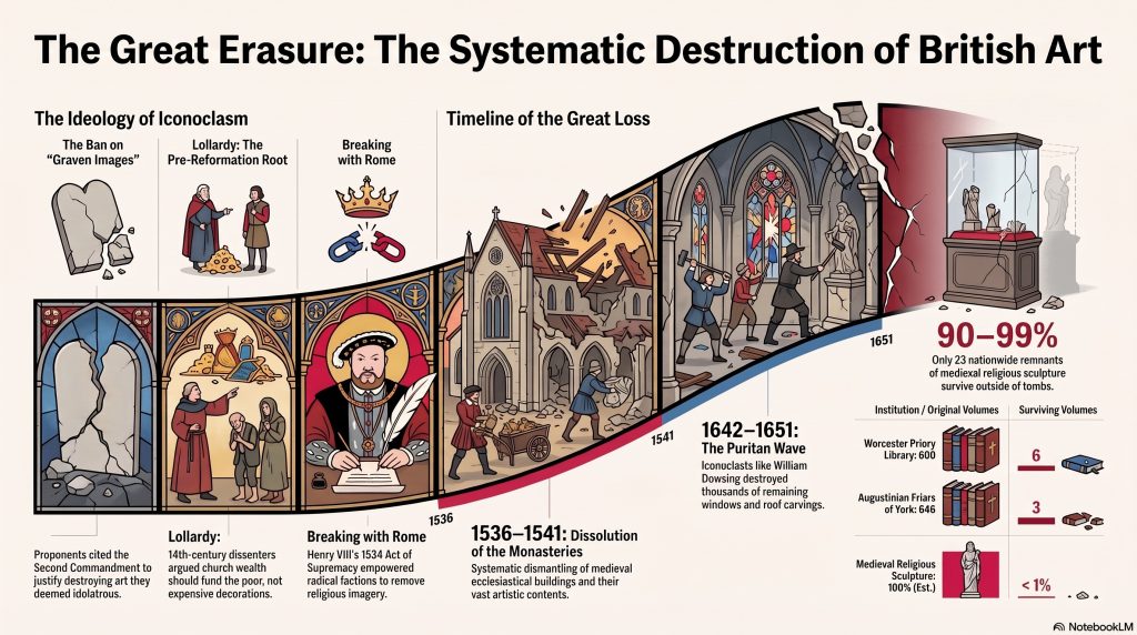
The sources provided are excerpts from a lecture by Dr. Laurence Shafe titled “The Destruction of British Art,” which explores the systematic loss of England’s medieval cultural heritage. Beginning with the Tudor Reformation in 1538, a methodical campaign of iconoclasm led to the destruction of an estimated 90-99% of religious art, including statues, wall paintings, and manuscripts. This movement was driven by a desire to eliminate idolatry and fundamentally reshape national identity by erasing the country’s Catholic past. While some treasures like the Wilton Diptych and the Lindisfarne Gospels survived, the vast majority of ecclesiastical beauty was lost during the Dissolution of the Monasteries and the later Puritan rule. The talk emphasizes that this “cultural revolution” severed Britain’s deep artistic links with Continental Europe, eventually leading to a shift toward secular and satirical art forms.
12-11 Tudor Art – The Wholesale Destruction of English Art
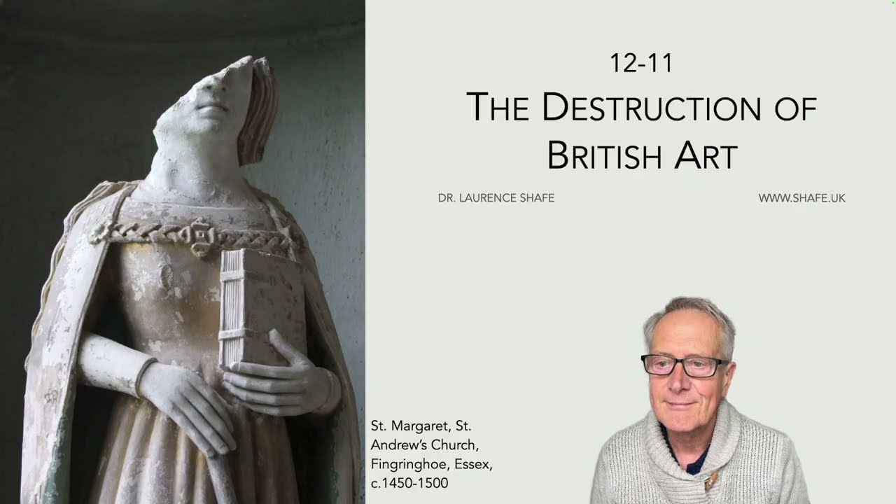
An entertaining conversation about The Wholesale Destruction of English Art created by Google NotebookLM from my notes:
The Ghost of the English Church
When you step into an ancient English parish church today, you are greeted by an atmosphere of quiet, austere majesty. We see the grey, naked stone and the stark, vaulted ceilings and assume this is how these spaces were always intended to look—simple, restrained, and perhaps a bit cold.
However, this aesthetic is a historical fiction. According to the research of Dr. Laurence Shafe, the “traditional” look of the British church is not an artistic choice, but the scar tissue of a radical “cultural revolution.” We are living in the quiet aftermath of a movement that systematically erased centuries of British visual history. We walk through a white void where there was once gold, experiencing a silence where there was once music. It was a methodical effort to fundamentally change the nation’s identity by obliterating its collective memory.
The 99% Statistic: A Comprehensive Erasure
It is difficult to quantify the sensory loss, but the data is staggering. While historians continue to debate the exact figures, estimates suggest that between 90% and 99% of all religious art in Britain was destroyed during the Reformation and its subsequent waves of iconoclasm.
This was not a series of random riots, but a comprehensive and methodical erasure. The destruction targeted every facet of visual and material culture:
• Banners and Tapestries: Fabric works used in processions and decoration.
• Sculpture: Statues of the Virgin Mary and patron saints; a 2002 Tate exhibition found only 23 remnants of medieval religious sculpture nationwide.
• Liturgical Items: Processional crosses, church plate, chalices, and ornate vestments.
• Literature: The loss of library contents was nearly total. At the Worcester Priory, only six books remain out of 600. The Augustinian Friars of York saw their 646-volume library reduced to a mere three surviving books.
• Music: Manuscripts and organs were destroyed on a vast scale due to religious disapproval.
To understand the sheer “teeth” of this methodical destruction, one need only look at the diary of William Dowsing, a Puritan iconoclast. In January 1643 alone, he recorded destroying 100 pictures at Haver and 1,000 pictures—including the twelve apostles and even the sun and moon—at Clare.
As the source text notes:
“It has been described as a ‘cultural revolution designed to obliterate England’s memory of who and what she had been.’”
Technicolor Temples: The Churches You Weren’t Taught About
Contrary to the plain stone we see today, pre-Reformation English churches were “technicolor” environments. They were brightly coloured, teeming with wall paintings and statues that connected the illiterate masses to the divine.
The suppression of this “art of the people” fundamentally changed who “owned” British culture. When the Church ceased to be the primary patron, art became a tool for the aristocracy and the satirist. The vibrant, communal visual culture was replaced by the private secular portraits of Gainsborough and Reynolds or the sharp satires of Hogarth.
A rare, intense window into this lost world is the “Doom” painting at Chaldon Church. Dating to approximately 1170, this massive depiction of the Last Judgement—complete with demons and the scales of justice—survived only because it was hidden under layers of distemper (a glue-based whitewash), preserving a fragment of the intense visual culture that once defined the English interior.
The Lollard Precursor: Iconoclasm Didn’t Start with Henry VIII
While the Reformation is associated with the Tudors, the roots of British iconoclasm reach back to the 1350s with John Wycliffe and the Lollards. This “heretical” group argued that the Church’s wealth was a corruption and that spending money on expensive art was a sin against the poor.
The Lollards’ “Twelve Conclusions,” posted at Westminster Hall in 1395, explicitly attacked the “ludicrousness” of revering images. Their influence extended even into the English language and script. Wycliffe’s translation of the Bible used the Middle English letter “thorn” (þ), pronounced as “th.” Around 1400, as the memory of the old script faded, the “thorn” was often visually misunderstood and replaced with a “y.” This led to the anachronistic modern pronunciation of “Ye Olde”—a linguistic scar representing a visual misunderstanding of our own past.
The Silent Survivors: How Economics Saved the Stained Glass
If the goal was total destruction, why does any medieval art remain? Often, the answer was simple economics. While mandates for destruction were clear, the cost of re-glazing an entire church window was prohibitively high for smaller parishes. Consequently, many medieval stained glass windows were spared because the congregation could not afford to replace them.
Ironically, this means medieval art survived best in the poorest areas. In wealthy Protestant centers like Norwich and Durham, where communities could afford new windows, the medieval glass was systematically purged. Occasionally, survival was an act of quiet resistance: the parishioners of Ufford in Suffolk famously saved their ornate font cover by “pretending to lose the key to the church” when the iconoclasts arrived.
The Ghost in the King James Bible
The story of William Tyndale embodies the transition from heretic to hero. Executed in 1536 for the “crime” of translating the Bible, his linguistic ghost still haunts the English language; the 1611 King James Bible is actually 83% Tyndale’s New Testament and 76% his Old Testament.
Tyndale’s legacy is a study in national irony:
• 1536: Convicted as a heretic and executed by strangulation and burning.
• 2002: Ranked number 26 in the BBC’s poll of the “100 Greatest Britons.”
The Rare Face of Royalty: Richard II
Prior to 1500, we generally don’t know what British monarchs looked like; the portraits in most country houses were painted centuries later with imaginary features. Richard II is the magnificent exception.
The Wilton Diptych (c. 1395–1399) is a masterpiece that reveals the sophistication of the lost English tradition. It shows Richard II being presented to the Virgin Mary, and its technical execution proves England’s link to the Continent. Unlike Italian artists who used “green earth” underpaint for flesh tones, the unknown artist of the Diptych used a copper-based green underpaint, a hallmark of Northern European technique.
Conclusion: A Ponderable Past
The modern British landscape is the result of successive erasures—from Henry VIII’s break with Rome to the Puritan zeal of the Civil War and the Blitz of WWII. There is a profound hypocrisy in the origins of this loss: Henry VIII broke with Rome for political supremacy but remained a Catholic who continued to use religious images himself, even as his policies unleashed the destruction of a nation’s heritage.
This long history of destruction has left us with a national identity built on missing pieces. It leads one to a provocative question: If this “memory” had not been obliterated—if the technicolor, visual link to Continental Europe had remained intact—how different would British culture look today?
12-12 Charles I: King and Collector
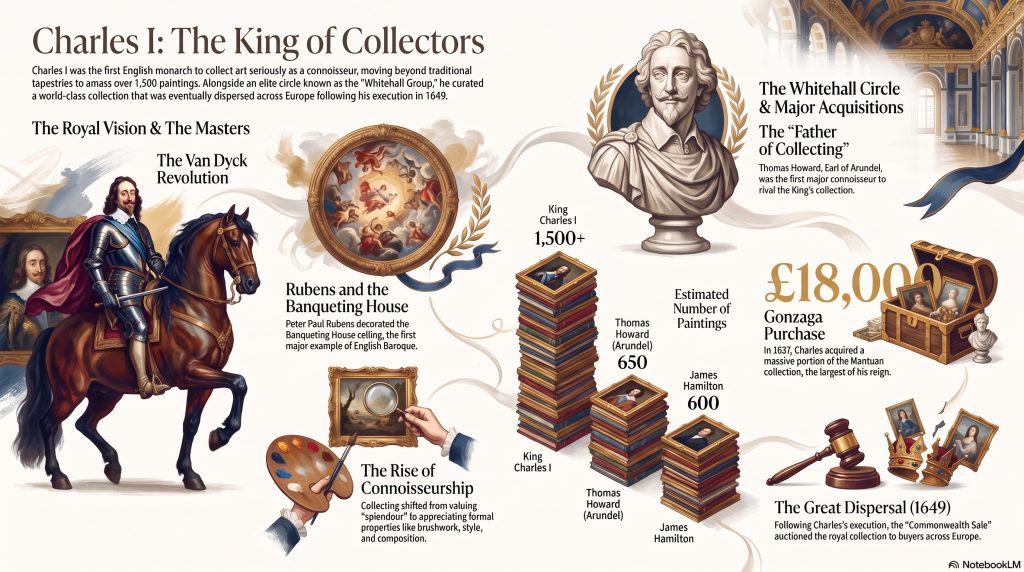
These sources provide a historical overview of King Charles I as a preeminent art collector and the broader evolution of art connoisseurship in Britain. The materials trace the origins of royal interest in aesthetics, from early cabinets of curiosities to the acquisition of world-class Renaissance masterpieces by artists like Titian, Rubens, and Van Dyck. Detailed timelines illustrate the political and cultural milestones of the Stuart era, culminating in the English Civil War and the subsequent dispersal of the royal collection during the Commonwealth Sale. The talk emphasizes how Charles I used portraiture and grand gallery acquisitions to project monarchical power and sophisticated taste. Furthermore, the documents highlight the transition of art from religious utility to a status symbol valued for its formal properties and the reputation of the creator. By examining specific exhibitions and historical inventories, the sources reconstruct the grandeur of a collection that remains foundational to the Royal Collection today.
12-12 My Notes on Charles I: King and Collector
A Podcast by Google NotebookLM based on my notes on Charles I: King and Collector
1. Introduction: The Royal Obsession
History largely remembers Charles I for the dramatic finale of his reign—his 1649 execution in front of the very Banqueting House he helped immortalize. However, his most enduring legacy was not political, but aesthetic. Before the Civil War tore the nation apart, Charles acted as the ultimate cultural disruptor, pivoting the Crown’s asset portfolio from the static gold and heavy fabrics of his predecessors into a high-stakes, liquid market of intellectual property: the European masterpiece. He didn’t just collect art; he turned its acquisition into a competitive sport, effectively inventing the “Royal Collection” as a statement of international branding and sovereign power. His obsession would lead him to risk both reputation and fortune on canvases, signaling a shift that birthed the modern art market as we know it today.
2. The “Father of Collecting” Wasn’t the King
While Charles eventually amassed over 1,500 paintings, he was not the intellectual pioneer of this movement. That title belongs to Thomas Howard, the 14th Earl of Arundel. Known as the “father of art collecting,” Arundel was the intellectual lead of the “Whitehall Group,” an elite circle of connoisseurs that included the King and the Duke of Buckingham.
The catalyst for the English movement was Arundel’s high-stakes 1613–14 trip to Italy. This wasn’t a casual tour; Arundel traveled with a small army of 34 attendants and the architect Inigo Jones, signaling the arrival of a serious new player on the European stage. This journey shifted the English perspective from simply owning objects to understanding “connoisseurship.” It remains a fascinating historical irony that the King, the ultimate authority in the land, was essentially following a trend set by his most senior aristocrat. By his death, Arundel’s inventory rivaled the King’s, boasting:
“650 paintings, including 37 Titians, 13 Raphael, 20 Veronese, 44 Holbein, 16 Durer, [and] 50 Van Dycks.”
3. When Paintings Were “Budget” Items
To a modern eye, a Titian or a Rubens is a priceless “blue-chip” asset. Yet, in the early 1600s, paintings were often viewed as secondary luxuries—under-valued inventory compared to tapestries, jewels, and gold plate. For Henry VIII and Elizabeth I, the ultimate status symbols were wall-sized tapestries or massive displays of silver-gilt plate.
The relative “low” value of paintings is strikingly illustrated by the collection of Cardinal Mazarin in France. His paintings were valued at 224,873 livres—a staggering sum until compared to his jewels and goldsmith work at 417,945 livres. Even more telling were his eighteen large diamonds, valued at nearly 2 million livres. However, the Whitehall Group realized that paintings were superior “moveable assets.” Unlike a ten-ton tapestry, a canvas allowed for a specific type of international branding that signaled “erudition and discernment.” Paintings eventually won the battle for cultural supremacy because they demonstrated that the owner possessed not just wealth, but the intellectual capital to judge a master’s hand.
4. The Protestant Loophole: Inventing “Connoisseurship”
The Art of the Brand Name
In a deeply divided religious era, English collectors faced a dilemma: how could a “sophisticated Protestant” justify owning works created for Catholic worship? The solution was a brilliant intellectual pivot: the invention of “connoisseurship.” This framework allowed art to be appreciated for its formal properties—brushwork, style, and composition—rather than its religious content. This mental loophole meant a collector could admire a Catholic master’s brush without needing to believe the dogma represented. Crucially, by 1626, the “artist’s reputation” became the primary driver of value in England. This was the birth of the “brand-name” artist, where the signature on the canvas became more valuable than the subject matter itself.
5. The Power of the “Agent” and the Art of the Deal
The 17th-century art market was an unsavoury world of copies, forgeries, and back-door deals. Because there was no transparent pricing, the “agent” became a high-stakes operative. Characters like the notorious Daniel Nys and the unsavoury Balthazar Gerbier toured Europe acting as spies, diplomats, and dealers. Even court musicians like Nicholas Lanier were sent abroad as spies to purchase under-valued inventory.
The most pivotal moment was the 1627 purchase of the Gonzaga (Mantuan) collection for £18,000, a move that instantly made the English Royal Collection a European powerhouse. This era was defined by political coercion; during Charles’s trip to Spain, while Spanish collectors were “resistant to selling,” Philip IV “compelled them” to give Charles gifts to facilitate diplomatic ties, including Titian’s Pardo Venus. In this market, a painting was never just a painting—it was a lever of statecraft.
6. The Biggest “Miss”: Ignoring Rembrandt and Caravaggio
Despite his reputation as a master connoisseur, Charles I committed the 17th-century equivalent of Blockbuster Video missing out on Netflix. He famously lacked the foresight to value the two most influential artists of the Baroque era: Rembrandt and Caravaggio. Although the King purchased a Rembrandt as early as 1629, the records indicate that “he never appreciated or valued Rembrandt or Caravaggio.” He was blinded by the elegance of Van Dyck and the sensuousness of Titian, completely missing the disruptive realism of the Dutch and Italian masters who would eventually redefine the entire medium.
7. Behind Every Great Masterpiece: The Women Collectors
While history focuses on the men of the Whitehall Group, women were the financial and intellectual engines of the movement. Queen Anne of Denmark actually seeded the royal art collection, bequeathing her works to Charles in 1621—four years before his coronation. Aletheia Howard, Countess of Arundel, was the movement’s true venture capitalist. The granddaughter of Bess of Hardwick, she used her vast inherited estates to fund the Arundel collection, traveling to Italy as a dedicated connoisseur in her own right.
Even the Duke of Buckingham’s household was anchored by a formidable woman. Katherine Manners, the Duchess of Buckingham, was the richest woman in Britain apart from royalty, and her purity served as a stark contrast to the perceived decadence of the art-obsessed court:
“…one of the few women of rank of the time whose gentleness and womanly tenderness, devotion and purity of life, were conspicuous in the midst of the almost universal corruption and immorality of the Court.”
8. Conclusion: The Great Dispersal
The grand experiment of the Whitehall Group ended on the auction block. Following Charles’s execution in 1649, the Republic initiated the “Commonwealth Sale.” This was the ultimate asset liquidation; arguably the world’s greatest art collection was sold off to satisfy state debts. These British treasures now define the core collections of the Prado in Madrid and the Kunsthistorisches Museum in Vienna, sold to rivals like Archduke Leopold Wilhelm.
The dispersal was so devastating to the national identity that, upon the Restoration in 1660, Charles II made it a priority to “recover” these items. He recognized that art collection was not merely a pursuit of beauty, but a pursuit of power. When a nation’s soul is sold to the highest bidder, its history becomes a ghost in foreign galleries. Yet, the fact that these works still command our attention today proves that the “royal obsession” of the 17th century successfully created the visual language of the modern world.
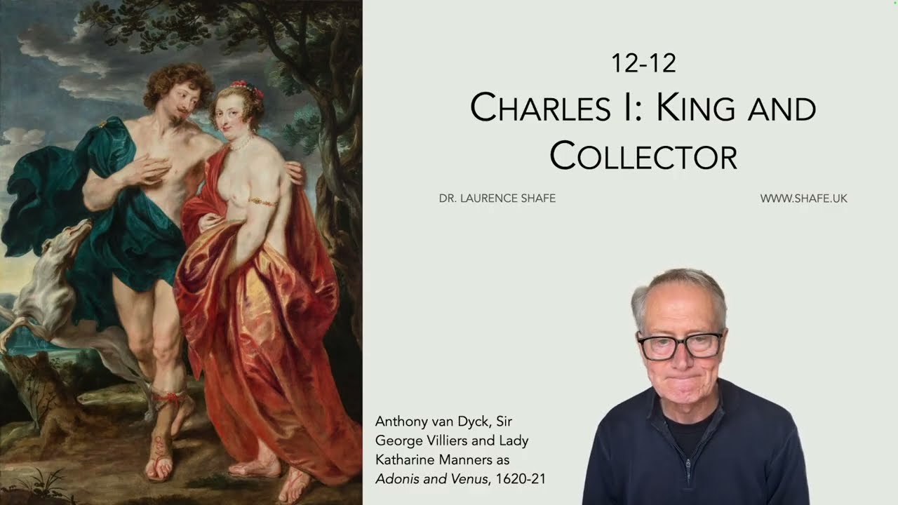
12-13 Inigo Jones: Man, Masques and Mansions
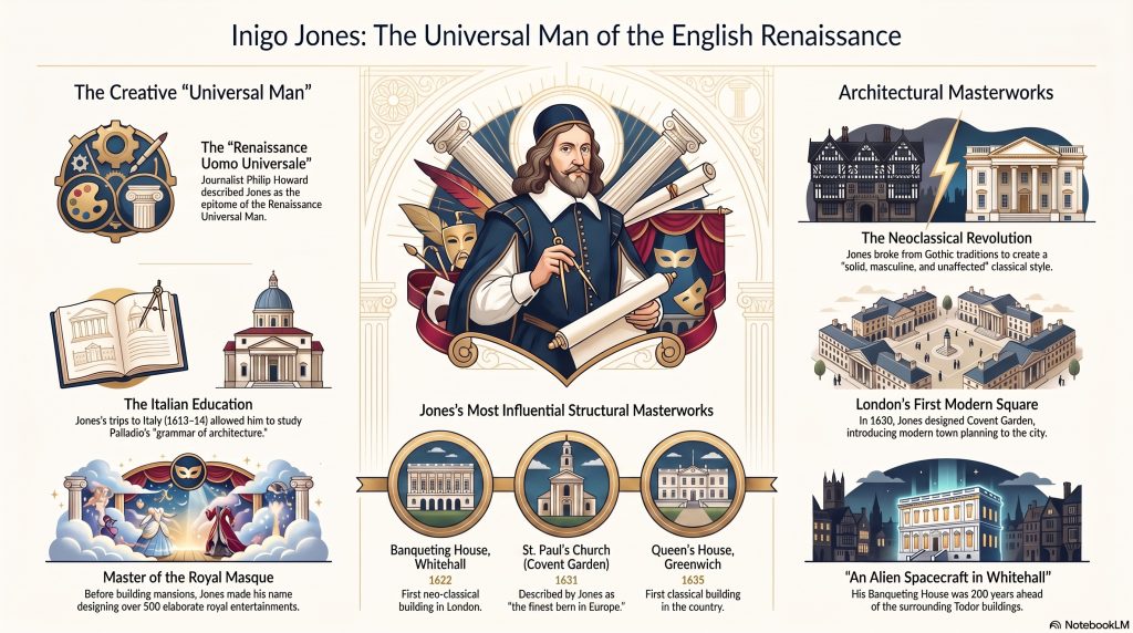
These sources provide a look at the life and legacy of Inigo Jones, a pivotal figure often described as the Renaissance “Universal Man” of Britain. While he is most famous as an architect who introduced a pure classical style to England, the documents highlight his diverse expertise in costume design, stage innovations, and royal masques. The materials trace his journey from a humble background to becoming a high-ranking official and advisor to James I and Charles I. His architectural masterpieces, such as the Banqueting House and Covent Garden, are noted for being centuries ahead of their time by utilizing the principles of symmetry and Roman design. Additionally, the talk addresses his complex personality, characterized by contemporaries as both brilliant and remarkably egotistical. Ultimately, the collection illustrates how Jones transformed the English landscape by replacing Gothic traditions with an innovative, clean classical aesthetic.
My Notes on 12-13 Stuart Art – Inigo Jones: Man, Masques and Mansions
A chat on Inigo Jones produced by Google NotebookLM from my notes
To traverse the stone-clad corridors of Whitehall today is to walk through a city that owes its very soul to a man who emerged from the grime of Smithfield. We celebrate the industrious Christopher Wren, yet we often overlook the figure who was a century ahead of him—the true “Renaissance Universal Man” who dragged England out of its medieval stupor. Before he was the King’s Surveyor, Inigo Jones was a Welsh cloth worker’s son, baptized at St Bartholomew-the-Less in a neighborhood defined by livestock markets and public executions. This stark origin makes his transformation into a “Dictator of Design” all the more anomalous. He did not merely design buildings; he imported a civilization, cutting through the “Jacobethan” clutter of his peers to establish a new, clean architectural language.
1. Traveling to Italy Was a Literal Death Gamble
In the early 17th century, the “Grand Tour” was far from the polished academic rite of passage it would later become. For an Englishman like Jones, crossing the continent to a Catholic stronghold like Italy required special permission and a stomach for extreme risk. The journey was so fraught with the specter of disease, bandits, and political volatility that it birthed a macabre form of financial speculation: betting on one’s own survival.
The traveler Fynes Moryson famously staked £100 on the wager that he would die during his travels, a bet that returned £300 upon his safe arrival home. This high-stakes environment served as a crucible for Jones’s resilience. He visited Italy multiple times—most notably in 1613-14 as the escort to the Earl of Arundel, the period’s most sophisticated connoisseur—to study the ruins of antiquity and the symmetry of Palladio.
“The conception of travel one gathers from Fynes Moryson is that of a very exciting form of sport, a sort of chase across Europe, in which the tourist was the fox, doubling and turning and diving into cover, while his friends in England laid three to one on his death.”
2. Before He Built Mansions, He Designed “Blackmoors” and Sea-Gods
Long before Jones turned seriously to architecture in 1614, he was a “picture maker” for the Stuart court. The royal masques—extravagant spectacles costing upwards of £3,000—served as his theatrical laboratory. It was here that he experimented with the manipulation of light and emotion that would later define his stone masterpieces.
In the 1605 The Masque of Blackness, Jones shocked the court by having Queen Anne and her ladies paint their skin black to portray “blackmoors.” His stage innovations were equally audacious: he designed a “great concave shell” that moved across the stage like water, illuminated by an indented “chevron of lights” that struck a “glorious beam” upon the performers. Whether he was sketching the blue-fleshed Oceanus with his sea-grass garland or inventing moving scenery, Jones was learning to control space and audience psychology—skills he would eventually translate from the ephemeral stage into permanent stone.
3. The Banqueting House Was an “Alien Spacecraft” in Tudor London
To appreciate the Banqueting House (1619–1622), one must first visualize the London of the 1620s. The city was a “ramshackle” and “higgledy-piggledy” maze of Gothic wooden buildings. Against this backdrop of Tudor courts and jousting yards, Jones’s symmetrical, stone structure appeared like an alien spacecraft.
It was a complete break from the “Jacobethan” style—that messy hybrid of Gothic forms and minor classical variations. Jones introduced a purity of design that was 200 years ahead of its time; the building remains the most influential in the country, even standing as the grim site of Charles I’s execution 27 years after its completion. His intent was to forge an architectural character that reflected the nation itself:
Jones intended his buildings to be “solid, masculine and unaffected.”
4. A “Proud, Vain, Quarrelsome Hypochondriac”
Despite the serenity of his buildings, the man himself was a storm of enormous egotism. His career was a series of professional triumphs and personal feuds, most famously with the poet Ben Jonson. While they collaborated on roughly 500 masques, the partnership was a clash of titans. Jones’s difficult temperament was a match for Jonson, a man of “fiery wit” who had once killed two men and was described as “haughty to rivals.”
To understand the human behind the drafting table, one must look at the colorful reputation he left behind:
A “proud, vain, quarrelsome hypochondriac” (as Michael Leapman characterized him).
Possessed of “enormous egotism and unbounded assurance” (according to John Summerson).
Target of Professional Gossip: Christopher Wren, perhaps seeking to diminish his predecessor, fueled a rumor 150 years later that Jones had been a mere “joiner” in St Paul’s churchyard—a slight against Jones’s actual Welsh cloth-worker roots.
5. He Treated Architecture Like a Foreign Language
Jones’s genius lay in his refusal to merely copy Italian styles. Instead, he mastered the “grammar” of the five orders: Tuscan, Doric, Ionic, Corinthian, and Composite. While his English contemporaries were restricted to drawing “neat platts and uprights” (basic plans and elevations), Jones had learned the “loose, freehand” Italian style of draughtsmanship.
The most vital evidence of his technical mind survives in his annotated copy of Palladio’s I Quattro Libri. Jones was not looking for minor variations; he was creating a new language. His annotations show a man obsessed with the “habit to do a thing with right reason.” He scrutinized the very chemical makeup of his materials, as seen in his famous note on marmo pesto:
“I obsearve that the Stucco that c[o]vers the Collombs of bricke is w[i]th marmo pesto [ground marble] and that within the house are only of malta [slaked lime stucco].”
This practical approach—utilizing ground marble for the durability of exterior columns while saving slaked lime for the interior—highlights a surveyor who understood that architecture was a marriage of high art and rigorous science.
Conclusion: The Legacy of a Dictator of Design
By the time he was appointed Surveyor-General in 1615, Jones had transformed the office into a “complete dictatorship of design.” He asserted absolute control over every facet of a project, from the broad strokes of town planning in Covent Garden down to the intricate sculpting of a chimney piece. He was the first to build in the classical style in Britain, essentially inventing the English Palladian tradition that would dominate for three centuries.
Jones was the pioneer who cut through the medieval maze to provide the blueprint for the modern city. As we move through an era of rapid technological and aesthetic upheaval, we must ask: Which modern “Universal Men” are currently reshaping our world in ways we might not yet fully appreciate?